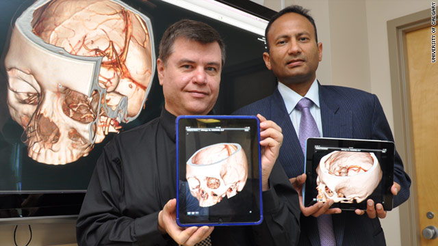
Mobile app helps doctors diagnose strokes — from cnn.com by Mark Milian
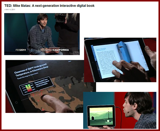
Mike Matas: A next-generation digital book (filmed March 2011)
About this talk
Software developer Mike Matas demos the first full-length interactive book for the iPad — with clever, swipeable video and graphics and some very cool data visualizations to play with. The book is “Our Choice,” Al Gore’s sequel to “An Inconvenient Truth.”
About Mike Matas
While at Apple, Mike Matas helped write the user interface for the iPhone and iPad. Now with Push Pop Press, he’s helping to rewrite the electronic book.
There’s an app for that class at Va. universities — from timesdispatch.com by Karin Kapsidelis
VCU and other universities are exploring the uses of
smartphones and mobile applications in and outside classrooms.
Originally saw this at
Ray Schroeder’s Online Learning Update blog
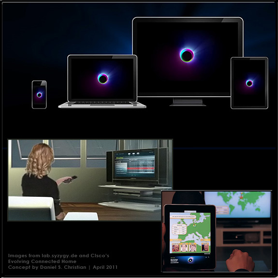
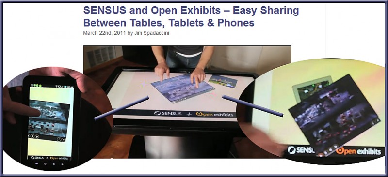
SENSUS and Open Exhibits – Easy Sharing Between Tables, Tablets & Phones — from ideum.com by Jim Spadaccini
.
The concept is simple:
Make networking and sharing transparent across
multitouch devices and operating systems.
.
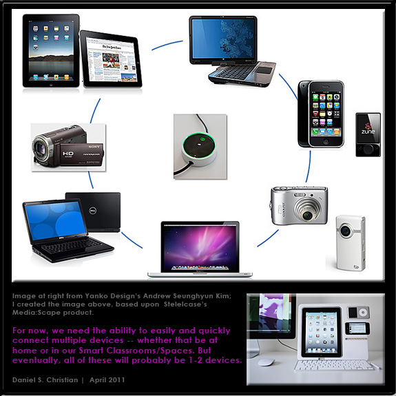
From DSC:
Even more powerful if such a file could be quickly sent/shared with a remote classroom/student!
Augmented reality: A travel essential — from wired.co.uk by David Rowan
It’s 2011, and you’re standing by the Brandenburg Gate in Germany’s capital examining the cracks and graffitied slogans of the vast and intimidating Berlin Wall. Sure, the physical wall fell back in 1989 — but now it’s back to add context to your journey, thanks to creative use of smartphone technology. Point your iPhone or your Android phone towards the wall’s original location, and superimposed on the phone’s camera image is an intricate 3D representation of the wall where it originally stood. City discovery just became augmented.
Until recently, “augmented reality” was an awkward and generally disappointing technology that involved downloading special software, holding strange symbols up to computer webcams, and waiting with fingers crossed for your movements to yield some sort of interactive movement on the screen. But the latest GPS-enabled, high-resolution-camera smartphones have given “AR” (as it’s known) a new and often very engaging life. So if you download a free app from a Dutch company called Layar, you can select layers of real-world information that will be displayed on your phone’s screen according to your location. When I travel, I now use these layers to learn the history of Rome or Red Square, or simply which way to walk to the nearest subway station. Just point your camera and follow the virtual signs.
Mobile content is twice as difficult [usability] — from Jakob Nielsen
Summary:
When reading from an iPhone-sized screen, comprehension scores for complex Web content were 48% of desktop monitor scores.
It’s more painful to use the Web on mobile phones than on desktop computers for many reasons:
- Slower downloads
- No physical keyboard for data entry
- No mouse for selection; no mouse buttons to issue commands and access contextual menus (indeed fewer signaling states, as discussed further in our seminar on Applying HCI Principles to Real World Problems: a touchscreen only signals “finger-down/up,” whereas a mouse has hover state in addition to button press/release)
- Small screen (often with tiny text)
- Websites designed for desktop access instead of following the usability guidelines for mobile
- App UIs that lack consistency
New research by R.I. Singh and colleagues from the University of Alberta provides one more reason: it’s much harder to understand complicated information when you’re reading through a peephole.
From DSC:
With the above said, the mobile learning wave cannot — and most likely should not — be stopped. The types of devices we end up using may change, but mobile learning will move forward.
For one example of this, see:
.
Also see:
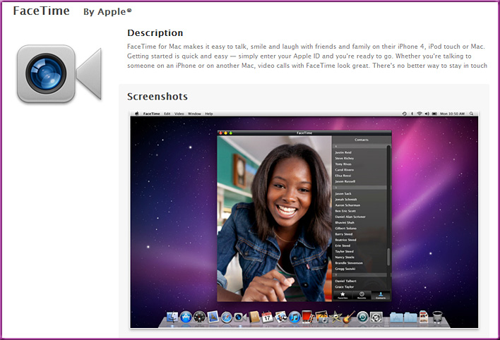
- FaceTime for Mac Arrives in Mac App Store…and It’s Not Free — from ReadWriteWeb.com by Sarah Perez
Barcode-to-bibliography app makes college ridiculously easy — from FastCompany.com by David Zax
It’s almost not fair to those who’ve already graduated. A new app from some University of Waterloo undergraduates makes that “works cited” page a cinch.
Sometimes a technology comes along that is so great it seems almost unjust to former generations. Aviation. The personal computer. The polio vaccine.
One gets the same feeling today when considering a new app out for iPhone and Android. Quick Cite, a 99-cent app, automates the task of putting together a bibliography–that arduous list of books, articles, and other sources consulted that goes at the end of a master’s thesis of PhD dissertation. The first thought you have is, “How much time scholars will henceforth save!” …
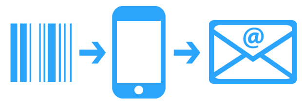
Snap a picture of a book’s barcode and send a citation for the book to your email. Choose from APA, MLA, Chicago, or IEEE styles.
Students Tap iPhone to Film, Distribute TV Series — from mobilized.allthingsd.com by Ina Fried


