Why Angry Birds is so successful and popular: A cognitive teardown of the user experience — from Pulse > UX by Charles L. Mauro

Excerpt:

Simple yet engaging interaction concept: This seems an obvious point, but few realize that a simple interaction model need not be, and rarely is, procedurally simple. Simplification means once users have a relatively brief period of experience with the software, their mental model of how the interface behaves is well formed and fully embedded. This is known technically as schema formation. In truly great user interfaces, this critical bit of skill acquisition takes place during a specific use cycle known as the First User Experience or FUE. When users are able to construct a robust schema quickly, they routinely rate the user interface as “simple”. However, simple does not equal engaging. It is possible to create a user interface solution that is initially perceived by users as simple. However, the challenge is to create a desire by users to continue interaction with a system over time, what we call user “engagement”.

What makes a user interface engaging is adding more detail to the user’s mental model at just the right time. Angry Birds’ simple interaction model is easy to learn because it allows the user to quickly develop a mental model of the game’s interaction methodology, core strategy and scoring processes. It is engaging, in fact addictive, due to the carefully scripted expansion of the user’s mental model of the strategy component and incremental increases in problem/solution methodology. These little birds are packed with clever behaviors that expand the user’s mental model at just the point when game-level complexity is increased. The process of creating simple, engaging interaction models turns out to be exceedingly complex. Most groups developing software today think expansion of the user’s mental model is for the birds. Not necessarily so.

Other key items discussed:

  • Simple yet engaging interaction concept
  • Cleverly managed response time
  • Short-term memory management
  • Mystery
  • How things sound
  • How things look
  • Measuring that which some say cannot be measured


From DSC:
What Apple is able to do with many of their hardware and software products, what Charles describes here with Angry Birds, what Steelcase did with their Media:Scape product’s puck — and other examples — point out that creating something that is “easy” is actually quite hard.


A hugely powerful vision: A potent addition to our learning ecosystems of the future


Daniel Christian:
A Vision of Our Future Learning Ecosystems


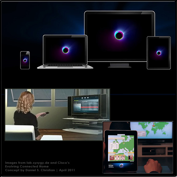
In the near future, as the computer, the television, the telephone (and more) continues to converge, we will most likely enjoy even more powerful capabilities to conveniently create and share our content as well as participate in a global learning ecosystem — whether that be from within our homes and/or from within our schools, colleges, universities and businesses throughout the world.

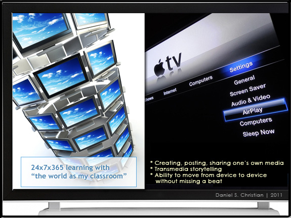
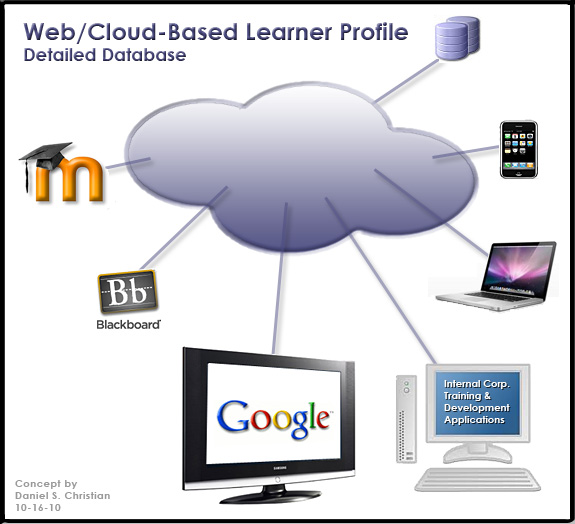
We will be teachers and students at the same time — even within the same hour — with online-based learning exchanges taking place all over the virtual and physical world.  Subject Matter Experts (SME’s) — in the form of online-based tutors, instructors, teachers, and professors — will be available on demand. Even more powerful/accurate/helpful learning engines will be involved behind the scenes in delivering up personalized, customized learning — available 24x7x365.  Cloud-based learner profiles may enter the equation as well.

The chances for creativity,  innovation, and entrepreneurship that are coming will be mind-blowing! What employers will be looking for — and where they can look for it — may change as well.

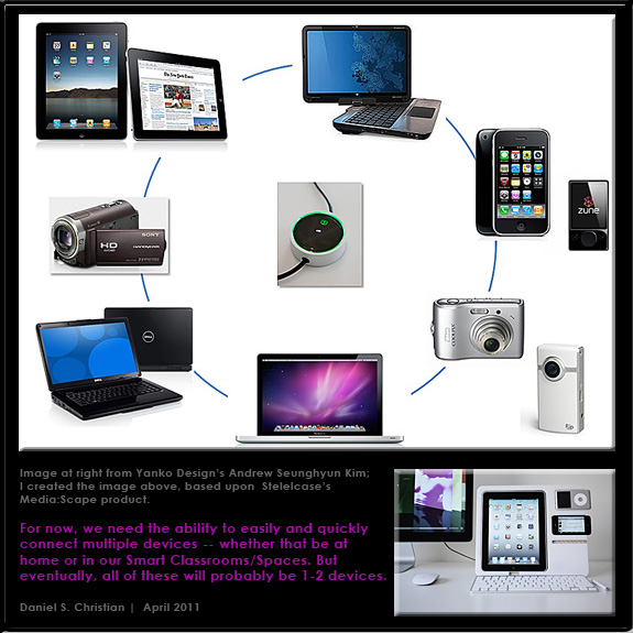
What we know today as the “television” will most likely play a significant role in this learning ecosystem of the future. But it won’t be like the TV we’ve come to know. It will be much more interactive and will be aware of who is using it — and what that person is interested in learning about. Technologies/applications like Apple’s AirPlay will become more standard, allowing a person to move from device to device without missing a  beat. Transmedia storytellers will thrive in this environment!

Much of the professionally done content will be created by teams of specialists, including the publishers of educational content, and the in-house teams of specialists within colleges, universities, and corporations around the globe. Perhaps consortiums of colleges/universities will each contribute some of the content — more readily accepting previous coursework that was delivered via their consortium’s membership.

An additional thought regarding higher education and K-12 and their Smart Classrooms/Spaces:
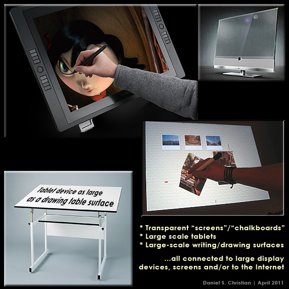
For input devices…
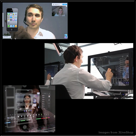
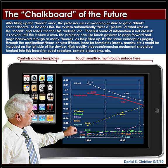
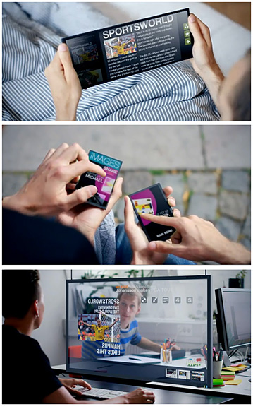
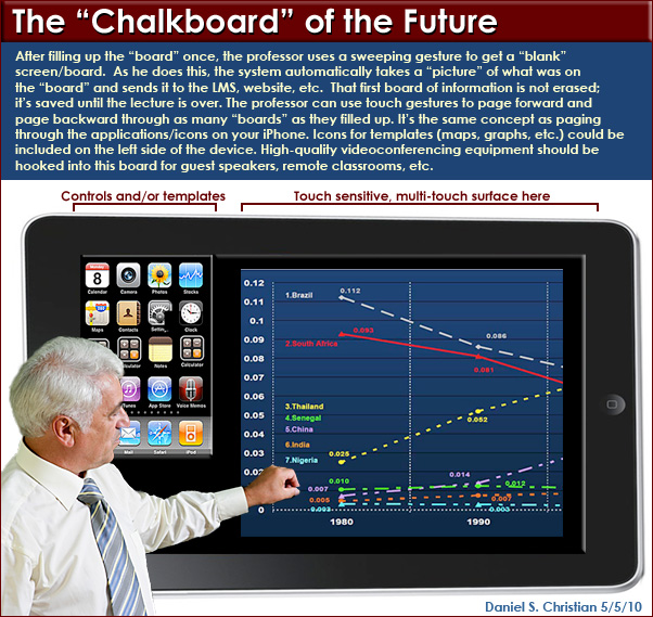
The “chalkboards” of the future may be transparent, or they may be on top of a drawing board-sized table or they may be tablet-based. But whatever form they take and whatever is displayed upon them, the ability to annotate will be there; with the resulting graphics saved and instantly distributed. (Eventually, we may get to voice-controlled Smart Classrooms, but we have a ways to go in that area…)

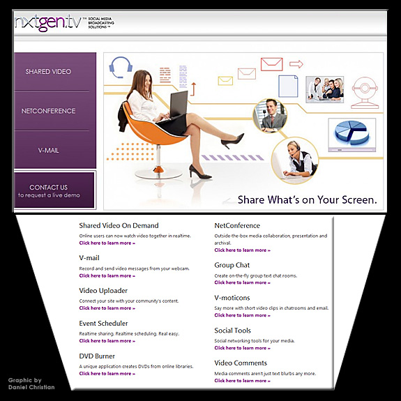
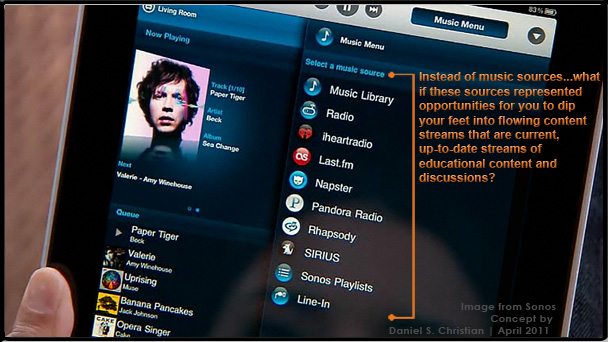
Below are some of the graphics that capture a bit of what I’m seeing in my mind…and in our futures.

Alternatively available as a PowerPoint Presentation (audio forthcoming in a future version)


— from Daniel S. Christian | April 2011

See also:

Addendum on 4-14-11:


Tagged with:  


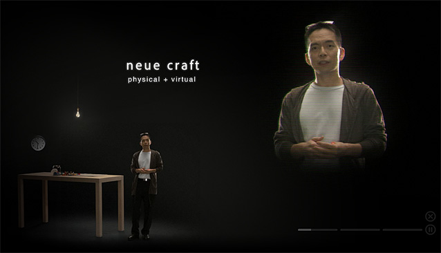
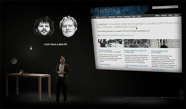
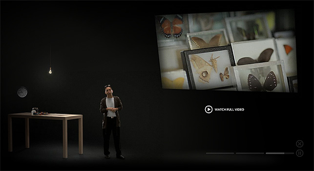
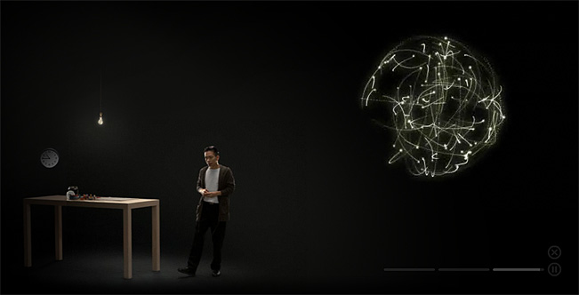
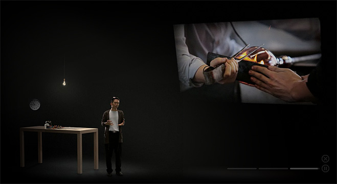
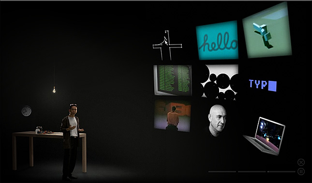
Adobe Museum of Digital Media, A lecture by John Maeda

From DSC:
If online courses could feature content done this well…wow! Incredibly well done. Engaging. Professsional. Cross-disciplinary. Multimedia-based. Creative. Innovative. Features a real craftsman at his work. The Forthcoming Walmart of Education will feature content at this level…blowing away most of the competition.


John Maeda -- Adobe Museum -- March 2011


This is also true for materials like the item below!


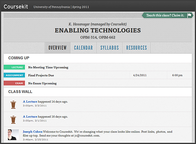
coursekit.com -- from students at the University of Pennsylvania

.

From DSC:
I saw this at Mashable, and I wanted to post it here for a couple of reasons:

  1. Note the consistent interface between their courses — when putting a course online, we are entering into the world of interface design where consistency is very key, very helpful.
  2. Students at the University of Pennsylvania created this — so this provides a glimpse into what these students think a “course” should look like.


What television is *really* becoming — by Philip Leigh at Inside Digital Media, Inc.

Excerpts:

Nicholas Negroponte who founded MIT’s Media Lab correctly put it sixteen years ago when he wrote in Being Digital “…the future open-architecture television is the personal computer, period.”

Televisions will become giant windows into the Internet Cloud. They’ll transform into electronic hearths through which family members gather to remotely share communications and social experiences as much as to watch videos. In addition to watching “TV” shows and movies, they’ll use future televisions for video phone calls, FaceBook updates, news feeds, interactive gaming, and knowledge quests within the nearly infinite mind of the Internet. Moreover, such features will augment one another. For example, FaceBook socializing will alert us to new videos our friends are watching.

The television-as-Internet-window will ultimately have a more intuitive interface. It’s likely to provide a combination of icon-apps as well as Internet browsing. Although the man-machine interface will continue to offer a mouse-and-keyboard for a while we’ll also use a gesture sensitive interface like Microsoft Kinect demonstrated in this video.

Tagged with:  

To “appify” old media, we need a new approach — from gigaom.com

The publishing industry is keeping its formerly inky fingers crossed that mobile devices, including the seemingly ubiquitous iPad, will save its behind. With the mobile market still in its infancy, it’s a tad early to be calling definitive trends, but there is one interesting tendency underway that may endure long-term — and that is the “appification” of media content.

This “appification” is being driven by one question — what is it that the audience wants? And the answer resoundingly is this: don’t just replicate the brand, give us something different.

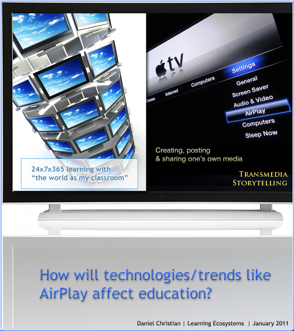
How will technologies like AirPlay affect education? I suggest 24x7x365 access on any device may be one way. By Daniel S. Christian at Learning Ecosystems blog-- 1-17-11.

.


Addendum on 1-20-11:
The future of the TV is online
— from telegraph.co.uk
Your television’s going to get connected, says Matt Warman


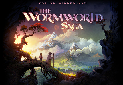
The Wormwood Saga

http://chapter01.wormworldsaga.com/

.

Also see:

daniellieske.com


From DSC:
First of all, my thanks to Mr. Joseph Byerwalter for this resource/link. I haven’t read this story; however I was intrigued by the user interface design here and it made me think of some related items/topics here:

I would have loved to see some more multimedia integrated into Daniel Lieske’s fabulous artwork — sound effects/audio/music and/or the capability of hearing the author read the story. Also, perhaps some interactivity may or may not add something here. In any case, this is a piece of the type of thing that I believe we will see much more of on devices like the iPad — as well as on Internet-connected televisions:

Incredibly-powerful, interactive, multimedia-based
methods of relaying one’s story or message.

Also, such endeavors open up a slew of potential future opportunities for our students (artists, musicians, sound engineers, writers, programmers, interface designers, user experience experts, etc.) — as well as chances to practice their creativity today.


How to build a mobile website — from SmashingMagazine.com

Conclusion:
As the worldwide shift to mobile continues, handheld device support will become increasingly important. Hopefully this article has left you with both the desire and toolset necessary to make mobile support a reality in your websites.

Although mobile occupies a significant chunk of global web browsing, the technology is still very much in its infancy. Just as standards emerged for desktop browsing, new standards are emerging to unify mobile browsers. This means that the techniques described in this article are only temporary, and it is your responsibility to stay on top of this ever-changing technology.

In fact, the only thing in web development that remains constant is the perpetual need to continue learning!

Musical instruments of the future – Reactable — from David Kusek, VP at Berklee College of Music

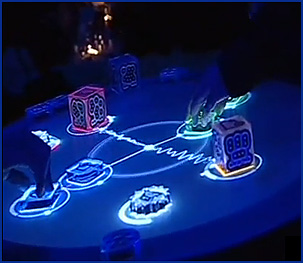
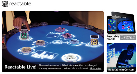
There is a lot of innovation happening with electronic music instrument and new interfaces.  Reactable is one of the latest in music technology fusing DJ culture, touch screen topography and electro-pop showmanship. Coming to an iPad near you.  Reactable says their company “is about the promotion of creativity and the mediation of culture through the application of the latest technologies in human computer interaction, music technology, graphics and computer vision.”  Check it out.

Music Instruments of the Future

.

Reactable

We use Lynda.com and the feedback has been excellent. Back in 1997, I took a 1-day seminar from Lynda Weinman out at SFSU’s Multimedia Studies Program. I learned more from her in a few hours then I have in many courses. She knows how to make things very understandable…and she’s a great teacher. If she doesn’t know the topic, she selects people who know how to explain that topic in easy-to-understand terms.

So when I saw this item — Connect@NMC: Panel Discussion Led By Laurie Burruss of Lynda.com – Implementing Lynda.com Campus-Wide — I felt that I should pass it along.

.

From Purple Squirrels: Future interface concepts.

Here is a small collection of [Ben Foster’s] favourite user interface concept videos. You will have to use Red-Blue 3D glasses to watch the second one properly.

30+ informative typography related blogs — from 1stwebdesigner.com

Typography is one of the crucial part of designing, specially web designing. Like the good ingredients can make food delicious; same in the case of typography, good typography can enhance the grace and beauty of your website.  You can bring creativity, simplicity and elegance to your design just by constructive use of type in it. If we say “You can’t design without Type” then it wouldn’t be inappropriate.

As a passionate typography lover, I’m always in search of great resources for fulfilling my needs of typography related news, articles, inspirations and new development in world of type. Today I thought to share some great blogs and websites, from my collection, related to typography to fulfill your “Type Need”. So pick the best blog of you interest from the list I have compiled below.

Drilling down with the Navigation Block in Moodle 2.0 — from by Moodle News by Joseph Thibault

Further resource from Joe about Moodle:

Tagged with:  

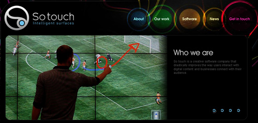
If educational publishers would publish content to be iPad ready, can you imagine the power of this type of an interface/”chalkboard of the future” in a professor’s hands? He/she could:

  • Intuitively and efficiently locate an item
  • Drag it over to the main viewing are
  • Enlarge a table of data and then annotate it
  • Quickly shrink a graphic and move it to the side of the screen after discussing it
  • Annotate a photo or a website
  • Send the captured image of what he/she had been displaying and working on to devices that can “hear” that signal
  • Etc. etc. etc.

..

so-touch.com


From DSC:
Also relevant here are the following images I created a while back:

One part of the board could provide downloadable, discipline-specific templates

Potential resources for the new "chalkboard" - compliments of the publishers

© 2024 | Daniel Christian