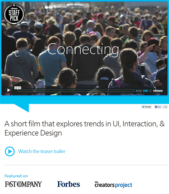
Connecting: A short film that explores trends in UI, Interaction, & Experience Design — from connectingthefilm.com with thanks to siobhan-o-flynn for scooping this!

.

ConnectingShortFilmApril2013


Description:

The 18 minute “Connecting” documentary is an exploration of the future of Interaction Design and User Experience from some of the industry’s thought leaders. As the role of software is catapulting forward, Interaction Design is seen to be not only increasing in importance dramatically, but also expected to play a leading role in shaping the coming “Internet of things.” Ultimately, when the digital and physical worlds become one, humans along with technology are potentially on the path to becoming a “super organism” capable of influencing and enabling a broad spectrum of new behaviors in the world. Available with Chinese, French, Spanish,German, Korean, Portuguese, and Japanese subtitles at on YouTube.

My reflections on “MOOCs of Hazard” – a well-thought out, balanced article by Andrew Delbanco


From DSC: Below are my reflections on MOOCs of Hazard — from newrepublic.com by Andrew Delbanco — who asks:  Will online education dampen the college experience? Yes. Will it be worth it? Well…


.
While I’m not sure that I agree with the idea that online education will dampen the college experience — and while I could point to some amazing capabilities that online education brings to the table in terms of true global exchanges — I’ll instead focus my comments on the following items:


1) Massively Open Online Courses (MOOCs) are recent experiments — ones that will continue to change/morph into something else.
They are half-baked at best, but they should not be taken lightly. Christensen, Horn, Johnson are spot on with their theories of disruption here, especially as they relate to innovations occurring within the virtual/digital realm.  For example, the technologies behind IBM’s Watson could be mixed into the list of ingredients that will be used to develop MOOCs in the future.  It would be a very powerful, effective MOOC indeed if you could get the following parties/functionalities to the table:

  • IBM — to provide Watson like auto-curation/filtering capabilities, artificial intelligence (AI) capabilities, as well as data mining/learning analytics expertise, joined by
  • Several highly-creative firms from the film/media/novel/storytelling industry, who would be further joined by
  • Experts from Human Computer Interaction (HCI)/user interface/user experience design teams, who would be further joined by
  • Programmers and interaction specialists from educational gaming endeavors (and from those who can design simulations), joined by
  • Instructional designers, joined by
  • The appropriate Subject Matter Experts who can be reached by the students as necessary, joined by
  • Those skilled in research and library services, joined by
  • Legal experts to assist with copyright issues, joined by
  • Other specialists in mobile learning,  3D, web development, database administration, animation, graphic design, musicians, etc.

It won’t be long before this type of powerful team gets pulled together — from some organizations(s) with deep pockets — and the content is interacted with and presented to us within our living rooms via connected/Smart TVs and via second screen devices/applications.

2) The benefits of MOOCs
  • For colleges/universities:
    • MOOCs offer some serious marketing horsepower (rather than sound pedagogical tools, at this point in time at least)
    • They are forcing higher ed to become much more innovative
    • They provide great opportunities to build one’s personalized learning networks, as they bring forth those colleagues who are interested in topic A, B, or C
    • They move us closer to team-based content creation and delivery
      .
  • For students:
    • They offer a much less expensive option to go exploring disciplines for themselves…to see if they enjoy (and/or are gifted in) topic A, B or C
    • They provide great opportunities to build one’s personalized learning networks, as they bring forth those colleagues who are interested in topic A, B, or C
    • They provide a chance to see what it’s like to learn about something in a digital/virtual manner

3)  The drawbacks of MOOCs:
  • MOOCs are not nearly the same thing as what has come to be known as “online learning” — at least in the higher ed industry. MOOCs do not yet offer what more “traditional” (can I say that?) online learning provides: Far more support and pedagogical/instructional design, instructor presence and dialog, student academic support services, advising, more student-to-student and student-to-faculty interaction, etc.
    .
  • MOOCs are like drinking from a firehose — there are too many blogs/RSS feeds, twitter feeds, websites, and other resources to review.

4) It would be wise for all of us to be involved with such experiments and have at least a subset of one’s college or university become much more nimble/responsive.


Also see:

From DSC:
After briefly reviewing the Infographic: The intricate anatomy of UX design (from fastcodesign.com by Mark Wilson) which “attempts to tackle the relationship between UX and all other aspects of design,” two thoughts immediately came to my mind:

  1. To me, this is why intuition and a sense of keeping things simple (less is more) are so important.
    .
  2. It’s a miracle that things lined up so that someone like Steve Jobs not only had so many of these design-related skills, but also the business skills — and opportunities — to persuade others to bring those ideas to fruition. Had he not grown up where he did…and had he not been mentored by whom he was mentored…and had he not met those he met…I wonder…how many of his ideas would have ever come to fruition?
    .


Also see:


Designing for context: The multiscreen ecosystem — from uxmag.com by Avi Itzkovitch

Excerpt:

To create applications and systems that are easy to use, it is crucial to understand the user and the context in which the app will be used. Understanding the context helps design systems that anticipate use cases at a relevant time of use. The more unobtrusive and transparent the experience is at the time of use, the better the design. This means the user does not have to think about the device he is using, changes in the environment, or changes in context, and can rely on great functionality and ease of use independent of his situation.

In traditional systems, the context of use did not change much. Whether the use was in the office or at a personal computer at home, the surroundings were similar and there was no need to adapt to different environments. In today’s world, smartphones, tablets, laptops, and smart TVs provide different services in different contexts. These services are consumed by a variety of users and require different interaction models, use cases, and planning. For this reason, UX professionals should first design for the context of use in order to provide better experiences and ultimately enhance the intended purpose of the product.

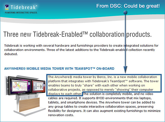
If this works well, it could be great for Smart Classrooms, collaborative workspaces, BYOD environments


From DSC:
The ability for students to contribute content and instantly share that content would be great! Not just display it, but share it! These are the types of concepts, tools, and technologies that I enjoy pursuing as they facilitate learning and collaboration. They have applications not only in K-20, but in the corporate world as well. (I realize there are some issues to work through with virus detection and potential copyright infringement.)

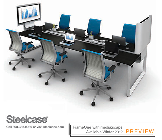
Speaking of not only displaying files but sharing them as well, it seems like this may be possible with Steelcase’s upcoming FrameOne with media:scape — when combined with HD videoconferencing. But I’m not positive about that.

.

FrameOne with mediascape


In Silicon Valley, designers emerge as rock stars — from Reuters.com by Gerry Shih

Excerpt:

The new breed of “user experience” designers – part sketch artist, part programmer, with a dash of behavioral scientist thrown in – are some of the most sought-after employees in technology. Entry-level interactive designers at startups are commanding salaries easily topping $80,000, almost twice the median pay for primarily print designers of about $45,000, according to a recent survey by the American Institute of Graphic Arts.

From DSC:
From my experience with Internet-related work and careers, most people are either gifted in the front end of things (interface design, graphic design, web design, etc.) or in the back end of things (programming, databases, scripting, e-commerce, security, etc.). I have seen individuals who can do both…but it’s rare that someone is deeply versed in both sides of the coin.

What are we doing in higher ed to foster more cross-disciplinary skills/assignments/projects/teams like this?


From DSC: Expectations, today, are getting hard to beat

Since Apple’s event yesterday, I’ve heard some conversations on the radio and reviewed several blog postings and articles about Apple’s announcements…many with a sense of let down (and some with the usual critical viewpoints by the backseat drivers out there who have never tried to invent anything, but who sure like to find fault with everyone else’s inventions and innovations).

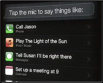
It made me reflect on how high our expectations are becoming these days!  It wasn’t enough that iCloud is coming on 10/12 (and who knows the directions that will take society in). It wasn’t enough to introduce some serious software-based innovations such as Siri (which bring some significant advancements in the world of artificial intelligence) or AirPlay for the iPhone.  It wasn’t enough to enter into the multi-billion dollar card industry with their new Cards app for the iPhone.  Wow…tough crowd.

What might these announcements — and expectations — mean for education? 
Well…I can see intelligent tutoring, intelligent agents, machine-to-machine communications, the continued growth of mobile learning, learning from the living room, the initiation of programs/events caused by changes in one’s location, continued convergence of the television/computer/telephone, continued use of videoconferencing on handheld devices, cloud-based textbooks/apps, and more.


Siri on the iPhone 4S -- October 4, 2011


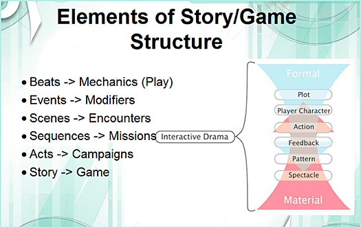
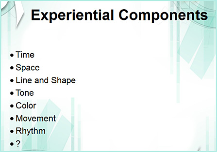
Designing Interactive Narrative -- Stephen Erin Dinehart -- September 2011


Example slides:


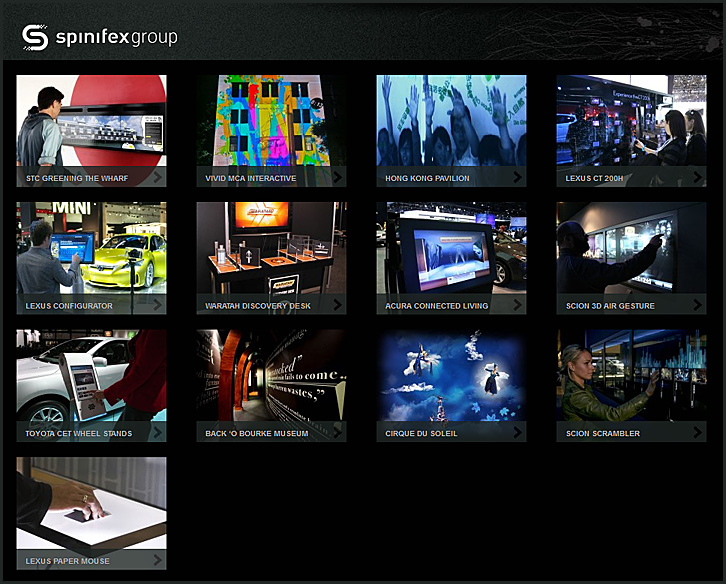
Nice HCI-related items at the interactive section of the spinifexgroup.com site

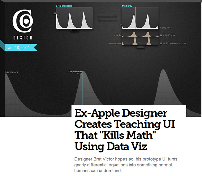
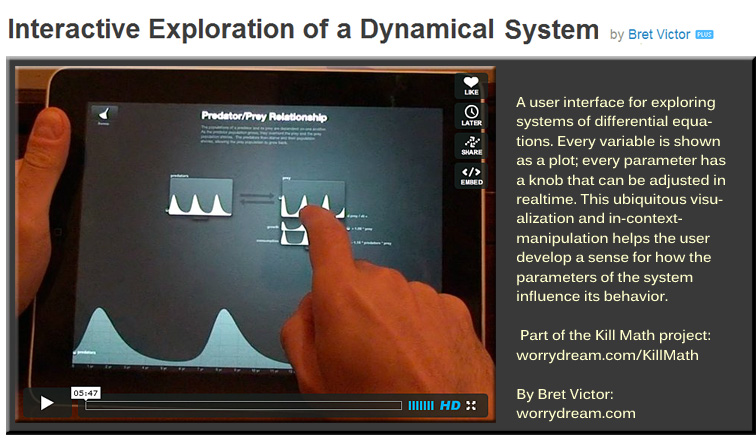
From Brett Victor’s “Kill Math” page

The power to understand and predict the quantities of the world should not be restricted to those with a freakish knack for manipulating abstract symbols.

When most people speak of Math, what they have in mind is more its mechanism than its essence. This “Math” consists of assigning meaning to a set of symbols, blindly shuffling around these symbols according to arcane rules, and then interpreting a meaning from the shuffled result. The process is not unlike casting lots.

This mechanism of math evolved for a reason: it was the most efficient means of modeling quantitative systems given the constraints of pencil and paper. Unfortunately, most people are not comfortable with bundling up meaning into abstract symbols and making them dance. Thus, the power of math beyond arithmetic is generally reserved for a clergy of scientists and engineers (many of whom struggle with symbolic abstractions more than they’ll actually admit).

We are no longer constrained by pencil and paper. The symbolic shuffle should no longer be taken for granted as the fundamental mechanism for understanding quantity and change. Math needs a new interface.

Also see:


Oslo Lux 2011

was a one day seminar (held back in January 2011) with associated art exhibition that explores the intersections of light, space and interaction.

image (c) Eddie Clemens 2011


Per Anthony Rowe:

The next LUX event is confirmed as taking place on 8-10 July 2011 in Wellington, New Zealand. The format will be similar to Oslo Lux – a mix of local and international artists, researchers, designers and architects will map out the overlaps of light, space and interaction. The event will take place over 2 1/2 days, and is timed to coincide with Te Aomarama, a Maori festival of light. See http://www.lux.org.nz/ for more information.


http://wellingtonlux.files.wordpress.com/2011/05/antivj03.jpg


Also see:

Two swans below fireworks projected onto fountain at Odaiba Water Show (Tokyo).


Tagged with:  

From DSC: It would be sharp (and somewhat James Bond-ish) if you could take the concepts within the iTable from Kyle Buckner Designs.com(esp. motorized parts and a customizable design)


Kyle Buckner Designs -- i table


…and combine those concepts with concepts found within a Microsoft Surface type of table: (esp. multi-touch capabilities for a group of people to work collaboratively on)


Microsoft Surface


…and combine those concepts with concepts found within Steelcase’s Media:Scape product (esp. the ability to bring your own device and instantly “connect” it and press a puck-like device to begin displaying it on the screen/table)


Steelcase's MediaScape

media:scape illustration


…kinda gives us a flavor for what may very well be part of the integration and continued convergence of devices…and it may be a device in your living room or study.


Also see:


© 2024 | Daniel Christian