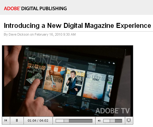
To “appify” old media, we need a new approach — from gigaom.com

The publishing industry is keeping its formerly inky fingers crossed that mobile devices, including the seemingly ubiquitous iPad, will save its behind. With the mobile market still in its infancy, it’s a tad early to be calling definitive trends, but there is one interesting tendency underway that may endure long-term — and that is the “appification” of media content.

This “appification” is being driven by one question — what is it that the audience wants? And the answer resoundingly is this: don’t just replicate the brand, give us something different.

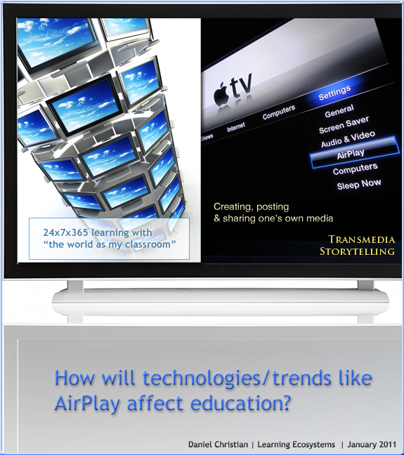
How will technologies like AirPlay affect education? I suggest 24x7x365 access on any device may be one way. By Daniel S. Christian at Learning Ecosystems blog-- 1-17-11.

.


Addendum on 1-20-11:
The future of the TV is online
— from telegraph.co.uk
Your television’s going to get connected, says Matt Warman


The Wormwood Saga

http://chapter01.wormworldsaga.com/

.

Also see:

daniellieske.com


From DSC:
First of all, my thanks to Mr. Joseph Byerwalter for this resource/link. I haven’t read this story; however I was intrigued by the user interface design here and it made me think of some related items/topics here:

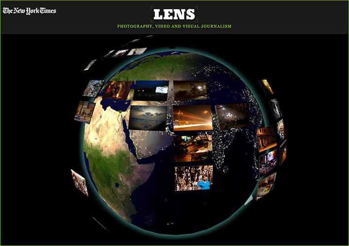
I would have loved to see some more multimedia integrated into Daniel Lieske’s fabulous artwork — sound effects/audio/music and/or the capability of hearing the author read the story. Also, perhaps some interactivity may or may not add something here. In any case, this is a piece of the type of thing that I believe we will see much more of on devices like the iPad — as well as on Internet-connected televisions:

Incredibly-powerful, interactive, multimedia-based
methods of relaying one’s story or message.

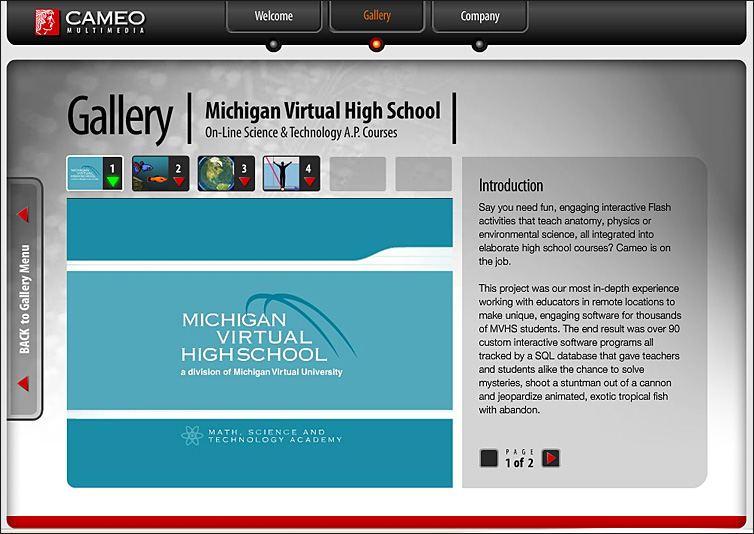
Also, such endeavors open up a slew of potential future opportunities for our students (artists, musicians, sound engineers, writers, programmers, interface designers, user experience experts, etc.) — as well as chances to practice their creativity today.


How to build a mobile website — from SmashingMagazine.com

Conclusion:
As the worldwide shift to mobile continues, handheld device support will become increasingly important. Hopefully this article has left you with both the desire and toolset necessary to make mobile support a reality in your websites.

Although mobile occupies a significant chunk of global web browsing, the technology is still very much in its infancy. Just as standards emerged for desktop browsing, new standards are emerging to unify mobile browsers. This means that the techniques described in this article are only temporary, and it is your responsibility to stay on top of this ever-changing technology.

In fact, the only thing in web development that remains constant is the perpetual need to continue learning!

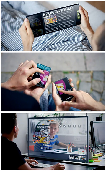
From Purple Squirrels: Future interface concepts.

Here is a small collection of [Ben Foster’s] favourite user interface concept videos. You will have to use Red-Blue 3D glasses to watch the second one properly.

30+ informative typography related blogs — from 1stwebdesigner.com

Typography is one of the crucial part of designing, specially web designing. Like the good ingredients can make food delicious; same in the case of typography, good typography can enhance the grace and beauty of your website.  You can bring creativity, simplicity and elegance to your design just by constructive use of type in it. If we say “You can’t design without Type” then it wouldn’t be inappropriate.

As a passionate typography lover, I’m always in search of great resources for fulfilling my needs of typography related news, articles, inspirations and new development in world of type. Today I thought to share some great blogs and websites, from my collection, related to typography to fulfill your “Type Need”. So pick the best blog of you interest from the list I have compiled below.

Drilling down with the Navigation Block in Moodle 2.0 — from by Moodle News by Joseph Thibault

Further resource from Joe about Moodle:

Tagged with:  

A DIY web design education — from noupe.com

  • Web Design 101: The Basics
  • Front-End and User Interface Design
  • Grids
  • Front-End Coding
  • HTML
  • CSS
  • User Experience
  • Information Architecture
  • Typography
  • Image Editing & Digital Illustration
  • Interactive Scripting
  • PHP
  • JavaScript and AJAX
  • Flash
  • Design Process and Project Management
  • Design Business
Tagged with:  
Tagged with:  

How to create a visual hierarchy — from the elearningcoach.com

From DSC:
This is my biggest concern about using the Moodle Content Management System. Moodle is often implemented using a 3-column approach (due to the “blocks”/functionality that either the system administrator and/or the faculty add) and, as such, one can quickly lose the visual hierarchy if one isn’t careful.

Tagged with:  

© 2024 | Daniel Christian