The ultimate guide to logo design: 40 pro tips — from creativebloq.com
Screen resolution & browser trends [infographic] — from theultralinx.com by Oliur Rahman
In Silicon Valley, designers emerge as rock stars — from Reuters.com by Gerry Shih
Excerpt:
The new breed of “user experience” designers – part sketch artist, part programmer, with a dash of behavioral scientist thrown in – are some of the most sought-after employees in technology. Entry-level interactive designers at startups are commanding salaries easily topping $80,000, almost twice the median pay for primarily print designers of about $45,000, according to a recent survey by the American Institute of Graphic Arts.
From DSC:
From my experience with Internet-related work and careers, most people are either gifted in the front end of things (interface design, graphic design, web design, etc.) or in the back end of things (programming, databases, scripting, e-commerce, security, etc.). I have seen individuals who can do both…but it’s rare that someone is deeply versed in both sides of the coin.
What are we doing in higher ed to foster more cross-disciplinary skills/assignments/projects/teams like this?
100 ideas that changed Graphic Design — from coolhunting.com by James Thorne
The most influential concepts in the history of the industry
Excerpt:
In the new chronologically ordered book “100 Ideas That Changed Graphic Design“, Steven Heller and Véronique Vienne explore the most important moments in an industry they themselves helped to define. Part of publisher Laurence King‘s popular “100 Ideas” series, the combination of symbols, techniques, archetypes, tropes and trends represents some of the major creative explosions that continue to inspire an array of visual mediums today. The scope is broad but intelligently refined, connecting all aspects of graphic design, from the age-old technique of text ornamentation to the relatively nascent appearance of pixelated images and digital type.
Another excerpt from book description
New in the “100 Ideas that Changed…” series, this book demonstrates how ideas influenced and defined graphic design, and how those ideas have manifested themselves in objects of design. The 100 entries, arranged broadly in chronological order, range from technical (overprinting, rub-on designs, split fountain); to stylistic (swashes on caps, loud typography, and white space); to objects (dust jackets, design handbooks); and methods (paper cut-outs, pixelation).
Written by one of the world’s leading authorities on graphic design and lavishly illustrated, the book is both a great source of inspiration and a provocative record of some of the best examples of graphic design from the last hundred years.
Also see:
- 73 Amazing & Cool Text Logos for Inspiration — from UltraLinx by Oliur Rahman
Data Visualization: Journalism’s Voyage West — from Stanford University
This visualization plots over 140,000 newspapers published over three centuries in the United States. The data comes from the Library of Congress’ “Chronicling America” project, which maintains a regularly updated directory of newspapers.
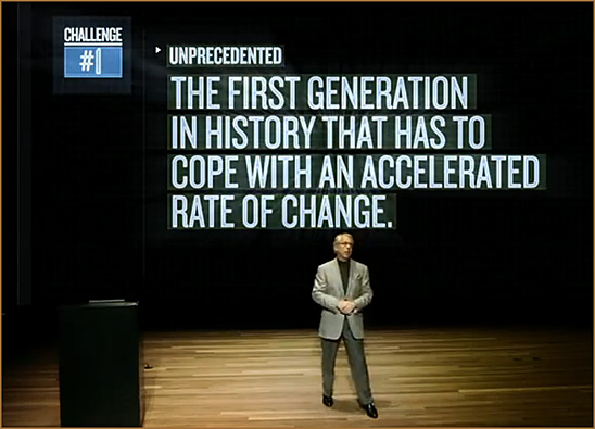
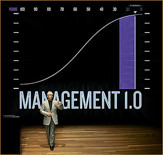
Reinventing the Technology of Human Accomplishment — by Gary Hamel; from the University of Phoenix Distinguished Guest Video Lecture Series.
From DSC:
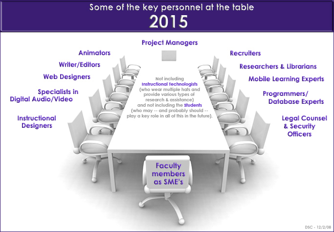
No matter whether you agree with what Gary is saying or not, can you imagine if every lecture contained this type of team-based assistance in creating the motion graphics, recording the video, editing the video, executing proper sound design principles, etc.? Most likely such an endeavor would be more achievable/successful when producing content in a controlled, studio type of environment — and then presenting it online (vs. trying to do this in front of a live classroom/audience/face-to-face.)
Anyway, very powerful communication channels here! Excellent use of motion graphics to backup his message. A transcript with bolded headings and colored main points would be great too. By the way, wouldn’t it be cool for “call outs” to appear — somewhat in an augmented reality sort of way — when a main point was just made?!
Description of video:
Watch Gary Hamel, celebrated management thinker and author and co-founder of the Management Innovation eXchange (MIX), make the case for reinventing management for the 21st century. In this fast-paced, idea-packed, 15-minute video essay, Hamel paints a vivid picture of what it means to build organizations that are fundamentally fit for the future—and genuinely fit for human beings. It’s time to radically rethink how we mobilize people and organize resources to productive ends. Here’s how we start.
This video is an excerpt from the University of Phoenix Distinguished Guest Video Lecture Series.
Sample screen shots:
From DSC:
Again, can you imagine the bump in engagement/attention spans if a faculty member could be backed up by these types of motion graphics!?
From DSC:
I realize that many of the for-profits are already using teams of specialists…but many others are not.
–Originally saw this at the
Higher Education Management blog by Keith Hampson
Be aware of the light source hitting your screen — from Digital Photography Schoolby Peter West Carey
Which also points to:
- How to calibrate your monitor — from Digital Photography School
What happens when sixth sense meets an iPad?–– from labnol.org
From DSC:
What a creative way to help people visualize your concept and to help bring your vision to a format that others can understand and work with! Great work on the digital video editing Zach!
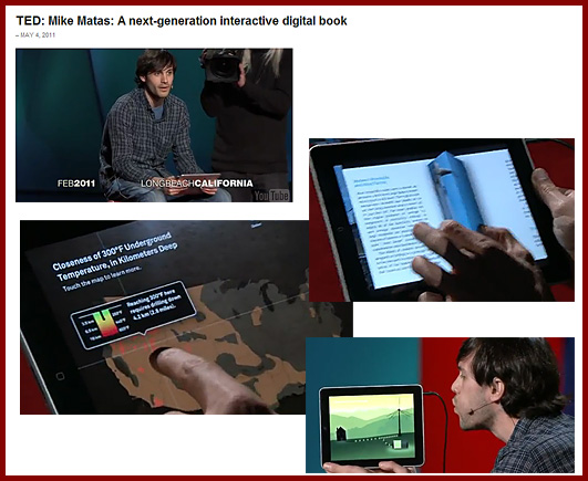
Mike Matas: A next-generation digital book (filmed March 2011)
About this talk
Software developer Mike Matas demos the first full-length interactive book for the iPad — with clever, swipeable video and graphics and some very cool data visualizations to play with. The book is “Our Choice,” Al Gore’s sequel to “An Inconvenient Truth.”
About Mike Matas
While at Apple, Mike Matas helped write the user interface for the iPhone and iPad. Now with Push Pop Press, he’s helping to rewrite the electronic book.
AP Interactive visualizes a future of stories that reach beyond text — from niemanlab.org
Excerpt:
Data visualization is “going through a kind of renaissance in journalism,” said Shazna Nessa, director of Interactive for the AP. What’s really behind the news collective’s uptick in graphics, she told me, is a kind of evolutionary change in journalism — one that’s reflected in the Interactive unit itself. Once a repository of charts and maps, the department is now creating what Nessa described as “comprehensive interactive stories,” and we can expect to see a lot more of them.
Visual storytelling: Interview with Nancy Duarte — from theelearningcoach.com
Excerpt:
Coach:
Why should learning experience designers care about stories? How does it relate to learning?
Nancy:
Stories are the oldest communication form and are proven to be easily recalled and repeated. If training material can be recalled and repeated, it’s most likely understood. Stories are a great container for memorable information. Relaying instructional content through metaphor and story helps the audience connect emotionally to the content being communicated. Instructional designers are on a steady quest to keep their audiences engaged and motivated, and storytelling is an effective strategy.


