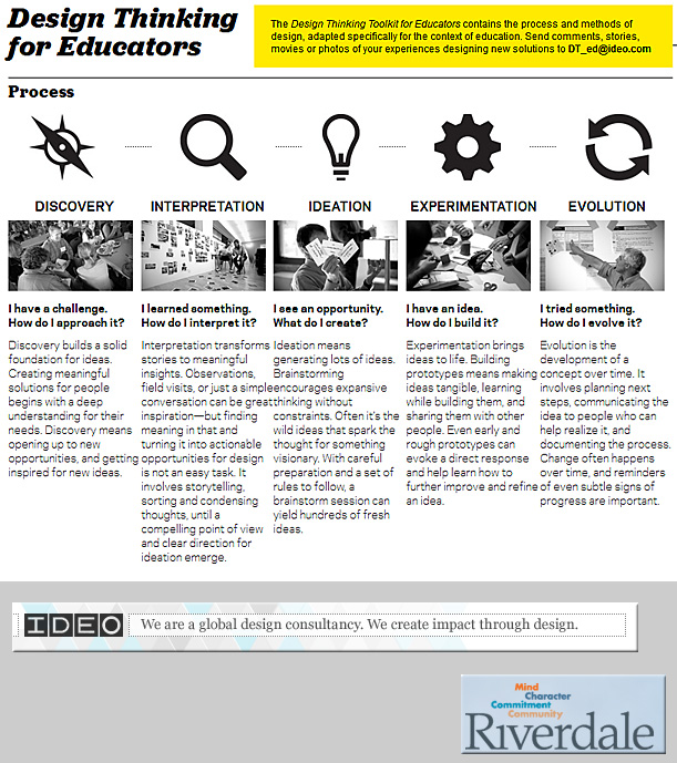
A 40-minute crash course in design thinking — from fastcodesign.com by Kyle VanHemert
Let this short film on designer and teacher Inge Druckrey open your eyes to the design details all around you.
Designing for context: The multiscreen ecosystem — from uxmag.com by Avi Itzkovitch
Excerpt:
To create applications and systems that are easy to use, it is crucial to understand the user and the context in which the app will be used. Understanding the context helps design systems that anticipate use cases at a relevant time of use. The more unobtrusive and transparent the experience is at the time of use, the better the design. This means the user does not have to think about the device he is using, changes in the environment, or changes in context, and can rely on great functionality and ease of use independent of his situation.
In traditional systems, the context of use did not change much. Whether the use was in the office or at a personal computer at home, the surroundings were similar and there was no need to adapt to different environments. In today’s world, smartphones, tablets, laptops, and smart TVs provide different services in different contexts. These services are consumed by a variety of users and require different interaction models, use cases, and planning. For this reason, UX professionals should first design for the context of use in order to provide better experiences and ultimately enhance the intended purpose of the product.
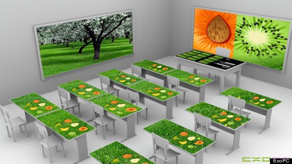
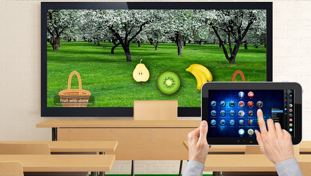
ExoPC and Panama team up to bring ‘tablet desks’ to students— from HuffingtonPost.com and The classroom of the future: Panama wants to give students “tablet desks” — from tabtimes.com by Doug Drinkwater
.
.
Adobe Photoshop Controller for EXOdesk
Adobe Photoshop TM Controller for EXOdesk makes it possible to control Photoshop TM from an EXOdesk in order to boost your productivity.
.
What’s happening in the workplace? — from metropolismag.com by Jan Johnson
.
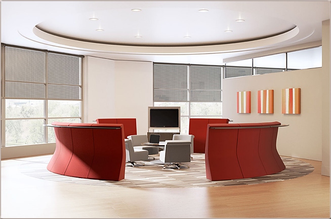
The evolving office in 2012, equipped with Allsteel’s collaborative furniture collection, Gather
.
Marriott Hotels & Resorts, Steelcase, and IDEO Collaborate to Innovate on the Future of Meetings and Work
Marriott Hotels & Resorts Launches “The Future of Work Innovation Co-Labs” To Offer Enhanced Hosted Work Experiences for Gen X and Gen Y Global Travelers.
Excerpt (emphasis DSC):
Los Angeles, Calif. – The nature of work is changing: it’s mobile, fast-paced and global. While most people demand choice and control to work when and how they want, wherever they are, working remotely doesn’t always offer consistent options when it comes to access, comforts and convenience. Marriott Hotels & Resorts, the flagship brand of Marriott International (NYSE:MAR); Steelcase, the world’s leading workplace experience provider; and global design and innovation consultancy, IDEO, today announced a collaboration to design, create and test innovative concepts and solutions for the future of work and meetings in hotels. The collaboration comes to life this week as a showcase of these potential solutions is unveiled at the Marriott Hotels & Resorts Global General Manager Conference in Los Angeles.
Also see:
Also see:
Also see:
- North Entrance of library brings new student workspace — from nineronline.com Elizabeth Bartholf
- .The Pitfalls of sitting too close — from sales-jobs.fins.com by Kelly Eggers
It sure sounded like a good idea. When Tuft and Lach Law, a small law practice in St. Paul, Minn. opted for open, shared office space, they didn’t expect to hate it. After all, numerous academic studies have shown that workers are more productive in open offices and, in the trendsetting tech industry, open plans are standard. For the law firm, it didn’t work out that way. “We had a receptionist and secretary sharing a workstation,” said Thomas Tuft. “The one with the biggest voice could be heard on the other’s phone calls and in attorney offices by clients on the phone with the attorneys.” If two people had to take a call simultaneously, they were forced to whisper..
..
- Creating Learning Spaces Through Collaboration – The Library is a 3rd Place to Consider — from Aaron Cohen Associates
. - Space-saving dome shaped bookshelf built into workspace ceiling – – from PSFK.com
.
A sample image from University of Exeter item re: learning spaces
.

The refurbished Forum Library
opens 24 hours a day, seven days a week.
Addendum on 5/24/12:
- Designing the Office to be less and more — from HermanMiller.com by Randall Braaksma
.
.
.
Animator creates incredible musical painting with $5 iPad app [VIDEO] — from Mashable by Christine Erickson
Excerpt:
“I really recommend it to anyone who does storyboards, concept art and animators, filmmakers, producers, whatever — this is the future,” says the video’s lead animator and director, Whitney Alexander. (You can see the full making-of here.)
Also see:
100 ideas that changed Graphic Design — from coolhunting.com by James Thorne
The most influential concepts in the history of the industry
Excerpt:
In the new chronologically ordered book “100 Ideas That Changed Graphic Design“, Steven Heller and Véronique Vienne explore the most important moments in an industry they themselves helped to define. Part of publisher Laurence King‘s popular “100 Ideas” series, the combination of symbols, techniques, archetypes, tropes and trends represents some of the major creative explosions that continue to inspire an array of visual mediums today. The scope is broad but intelligently refined, connecting all aspects of graphic design, from the age-old technique of text ornamentation to the relatively nascent appearance of pixelated images and digital type.
Another excerpt from book description
New in the “100 Ideas that Changed…” series, this book demonstrates how ideas influenced and defined graphic design, and how those ideas have manifested themselves in objects of design. The 100 entries, arranged broadly in chronological order, range from technical (overprinting, rub-on designs, split fountain); to stylistic (swashes on caps, loud typography, and white space); to objects (dust jackets, design handbooks); and methods (paper cut-outs, pixelation).
Written by one of the world’s leading authorities on graphic design and lavishly illustrated, the book is both a great source of inspiration and a provocative record of some of the best examples of graphic design from the last hundred years.
Also see:
- 73 Amazing & Cool Text Logos for Inspiration — from UltraLinx by Oliur Rahman
Learning Space Design Resources — from the University of Arizona
The University of Sydney: Standards for learning spaces
The University’s vision of learning space for the 21st century is a student-centred, quality assured, seamless environment encompassing physical and virtual networks that promote engaged enquiry. The Learning Space review will contribute to a shared view on learning and teaching space and facilities and the related issues of flexibility, capacity, innovation, integration and sustainability. Learning space will be developed and evaluated in line with these principles to develop best practice standards for formal, informal and virtual learning and teaching space.
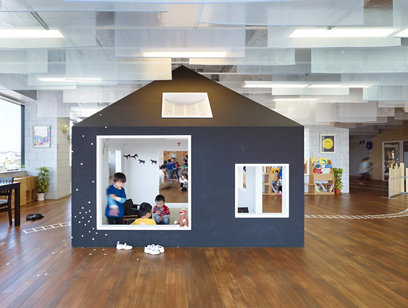
suppose design office: kiddy shonan C/X nursery school
‘kiddy shonan C/X’ by suppose design office
Learning Environments: Where Space, Technology, and Culture Converge — from Educause
Also see:
Also see:
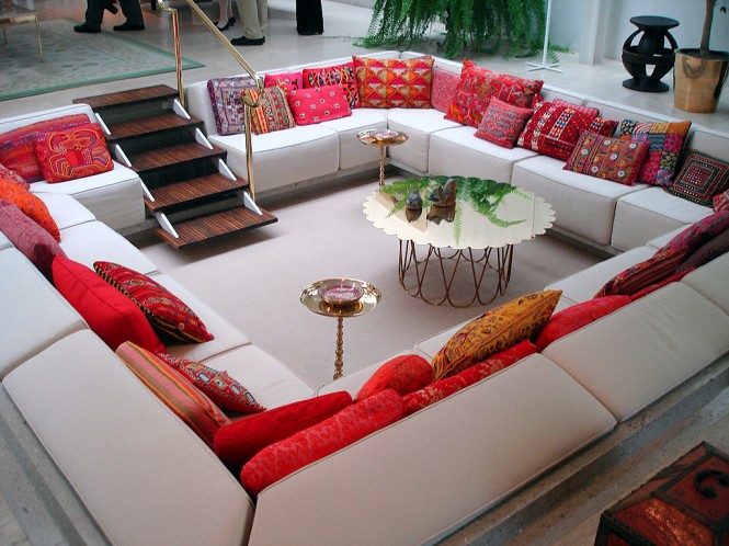
Famous Miller House Via spfaust
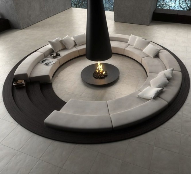
Via Novoceram
Addendum on 2/14/12
- The Almere Library has been designed by Meyer en van Schooten Architects and is located in Almere, The Netherlands.
.
From DSC:
What I take from this:
- Allow for scanning — there’s too much information to take in when drinking from today’s firehoses!
- Use white space
- Be brief as possible
- Bulleted lists can be helpful
- Provide bolding to highlight key points/topics
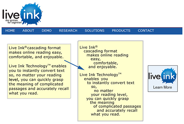
I noticed McGraw-Hill is starting to incorporate this technology:
- McGraw-Hill’s Connect platform is incorporating Live Ink, a cool technology that converts text into an easy to read cascading format.
— from SmartTech Roundup: 2012 Predictions & Digital Reading


