Watch this awesome video on the future of education — from DIY
.
.
From DSC:
As I like to say, technology is great when it works — but when it doesn’t, there are few things more frustrating that exist in the world today!
Adobe unveils new Acrobat X solutions — from Assistive Technologies
Also see Adobe’s site re: Acrobat X:
Presentation from Nancy Duarte, HOW, and PicScout:
Mac version- http://bit.ly/9qhWTK
PC Version- http://bit.ly/aubGb3
.
.
From DSC:
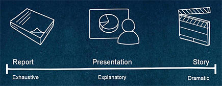
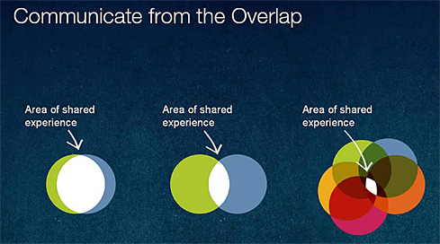
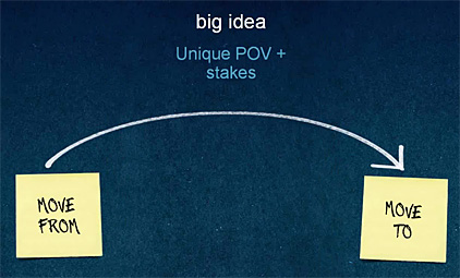
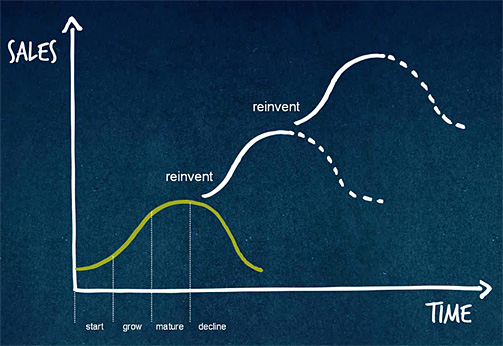
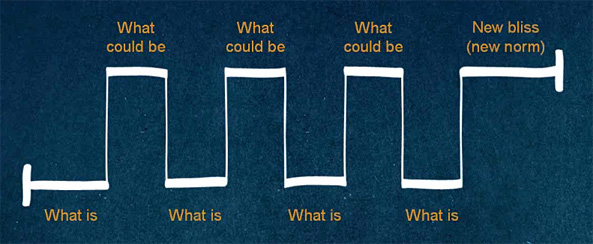
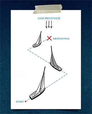
This was a great presentation by Nancy Duarte that is very much worth checking out for anyone who regularly communicates information to others. I especially appreciated the slide on the need for all of us — in our organizations as well as for each of us as individuals — to constantly reinvent ourselves.
Here are some example slides:
.
.
.
.
.
.
Resource from
Presentation Advisors by Jonathan Thomas
.
Per Jonathan:
I’ve written before about the power of storytelling in presentations. I am so passionate about the “Story” that it seemed serendipitous when I joined the Story Worldwide team to help spread their brand.
Also see:
StoryCorps.org/
Our mission is to provide Americans of all backgrounds and beliefs with the opportunity to record, share, and preserve the stories of our lives.
Prezi: A better way of doing presentations — from Faculty Focus by: John Orlando, PhD
Everyone seems to assume that a presentation must be accompanied by a PowerPoint. Conferences even require presenters to submit their PowerPoints as a condition of being accepted. But we’ve all seen terrible PowerPoints that detract from the presentation, and many people just don’t use PowerPoints well, hence the term “PowerPoint-induced sleep.”
But maybe it’s time to (gasp) question the use of PowerPoint itself (stick with me here)! Why do we assume that we must put up an outline of our points to help the audience understand them? The best presentations on TED are not accompanied by a PowerPoint of bulleted lists, but rather photos or other imagery that illustrate a point or make an effect. A speaker might flash the simple word “why” on the screen to prepare the audience for questioning a common belief. A single photo could be used to elicit a laugh or set the tone of the discussion.
One alternative to boring PowerPoint slides is to use Prezi. This web-based tool allows the user to create a single canvas of text, images, videos, etc. online. The presenter flies from location to location on the canvas, sometimes turning elements upside down, sometimes zooming in or out, to explore the relationship between ideas. Like a painter, the canvas draws the developer to choose visual imagery to create the presentation, in contrast to the text-heavy, outline-based methodology of PowerPoint.
Alternatives to Powerpoint: Exploring campus futures — from NITLE
What alternatives to Powerpoint are campuses exploring? NITLE launched a predictions market about this subject, and the results are fascinating.
We picked the following alternative presentation tools after researching via articles, blogs, and Twitter discussions:
From DSC:
This is where publishers need to go — at least as part of their delivery of educational content. Bring up a textbook, maneuver to chapter ___, and drag the video from the left side of the screen to the right side. Or drag an entire chapter to the right side of the screen to have that chapter unfold before your eyes — and then select the item you want to focus on. Drag your fingers to enlarge the graphics/graph/photo/table/etc.; when you are done discussing that item, shrink it back down, gesture it to the side, and go to the next item. Have the board take pictures accordingly and send those pictures to multiple sources.
…