From DSC:
After briefly reviewing the Infographic: The intricate anatomy of UX design (from fastcodesign.com by Mark Wilson) which “attempts to tackle the relationship between UX and all other aspects of design,” two thoughts immediately came to my mind:

  1. To me, this is why intuition and a sense of keeping things simple (less is more) are so important.
    .
  2. It’s a miracle that things lined up so that someone like Steve Jobs not only had so many of these design-related skills, but also the business skills — and opportunities — to persuade others to bring those ideas to fruition. Had he not grown up where he did…and had he not been mentored by whom he was mentored…and had he not met those he met…I wonder…how many of his ideas would have ever come to fruition?
    .


Also see:


Mayer & Clark – 10 brilliant design rules for e-learning — from Donald Clark

Excerpt:

Richard Mayer and Ruth Clark are among the foremost researchers in the empirical testing of media and media mix hypotheses in online learning. Their e-Learning and the Science of Instruction (2003) covers seven design principles; multimedia, contiguity, modality, redundancy, coherence, personalisation, and practice opportunities. Clear explanations are given about the risks of ignoring these principles – with support from worked examples and case study challenges. It should be a compulsory text for online learning designers.

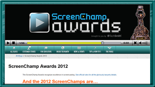
ScreenChampsAwards-Techsmith2012


Excerpt:

Description:

Enter up to three (3) screencast videos. Videos will be assigned a category based on the information you provide (so please be as detailed as possible!). Categories are: Education (videos with a focus on teaching and/or schools, at any level); Tutorial/Training (videos with a focus on training or tutorial content); Sales and Marketing (videos made to sell or persuade); and Wildcard (videos that don’t fit in the previous categories).

40 free world flags icon sets — from hongkiat.com by Michael Poh

.

Tagged with:  

30 compelling examples of visual storytelling on the web — from dtelepathy.com by Jessica Moon

Excerpt:

Storytelling is a powerful approach that can, when done right, compel users to convert more effectively than what any amount of optimization, crazy visual callouts, or awesome interactive elements can do otherwise. Much like how we expect to see a moral at the end of a book, we expect to find a purpose at the end of a site with a storytelling experience. When the path to the “moral of the story” (or conversion point, to be more specific) is laid out clearly in front of our users’ eyes, the rest of the work lies simply in convincing them that the purpose is really worth grabbing on to… which is great since with storytelling, a user is normally in the mindset of learning more about what the story has to offer. So take a look at the examples below and experience how their visual storytelling compels you to continue scrolling down their pages!

1)  Learning Ideas: Making Classroom Equipment — from makerspace.com by Joel Rosenberg (8/6/12)
This is the first post in a series about ideas for learning in a Makerspace.

2)  Learning Ideas: Math in action — from makerspace.com by Joel Rosenberg (8/28/12)
This is the second post in a series about ideas for learning in a Makerspace.

3) Learning Ideas: Cheap circuits and subsystems Learning Ideas: Math in action
This is the third post in a series about ideas for learning in a Makerspace.

4) Learning Ideas: Design options, cross-referencing, cohesion — from makerspace.com by Joel Rosenberg (11/7/12)
This is the fourth and final post in a series about ideas for learning in a Makerspace.


.

Also see:

Tagged with:  


Also see:


.

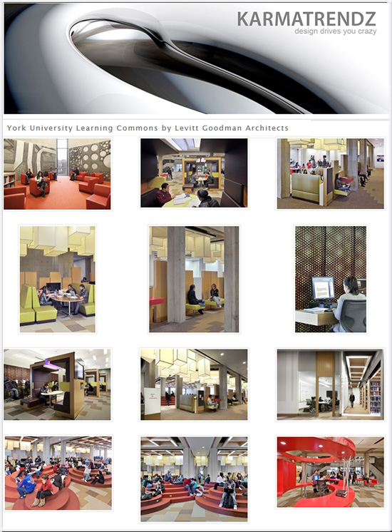
Architects: Levitt Goodman Architects
Location: Scott Library, York University, Toronto, Canada
Architect In Charge: Brock James
Design Team: Kris Payne, Amanda Reed
Project Year: 2010
Project Area: 17,000 sq ft
Client: York University
Budget: $1.9 Million
Photographs: Bob Gundu, Ben Rahn © A-Frame Inc.


.— originally saw this at Anne Whisken’s curated content at scoop.it

Stunning home library design ideas — from woordup.com

.

Home Library Design

.

Home Library Design

.

Home Library Design

.

Tagged with:  

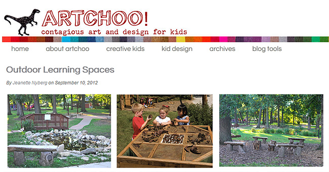
Outdoor learning spaces [Nyberg]

Outdoor learning spaces -- from artchoo.com by Jeanette Nyberg

Tagged with:  

A 40-minute crash course in design thinking  — from fastcodesign.com by Kyle VanHemert
Let this short film on designer and teacher Inge Druckrey open your eyes to the design details all around you.

Tagged with:  

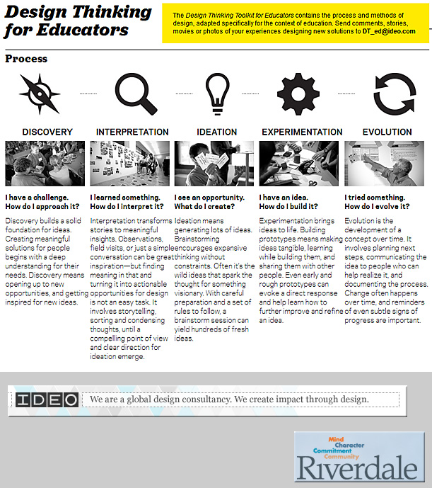
http://designthinkingforeducators.com/

Tagged with:  

Designing for context: The multiscreen ecosystem — from uxmag.com by Avi Itzkovitch

Excerpt:

To create applications and systems that are easy to use, it is crucial to understand the user and the context in which the app will be used. Understanding the context helps design systems that anticipate use cases at a relevant time of use. The more unobtrusive and transparent the experience is at the time of use, the better the design. This means the user does not have to think about the device he is using, changes in the environment, or changes in context, and can rely on great functionality and ease of use independent of his situation.

In traditional systems, the context of use did not change much. Whether the use was in the office or at a personal computer at home, the surroundings were similar and there was no need to adapt to different environments. In today’s world, smartphones, tablets, laptops, and smart TVs provide different services in different contexts. These services are consumed by a variety of users and require different interaction models, use cases, and planning. For this reason, UX professionals should first design for the context of use in order to provide better experiences and ultimately enhance the intended purpose of the product.

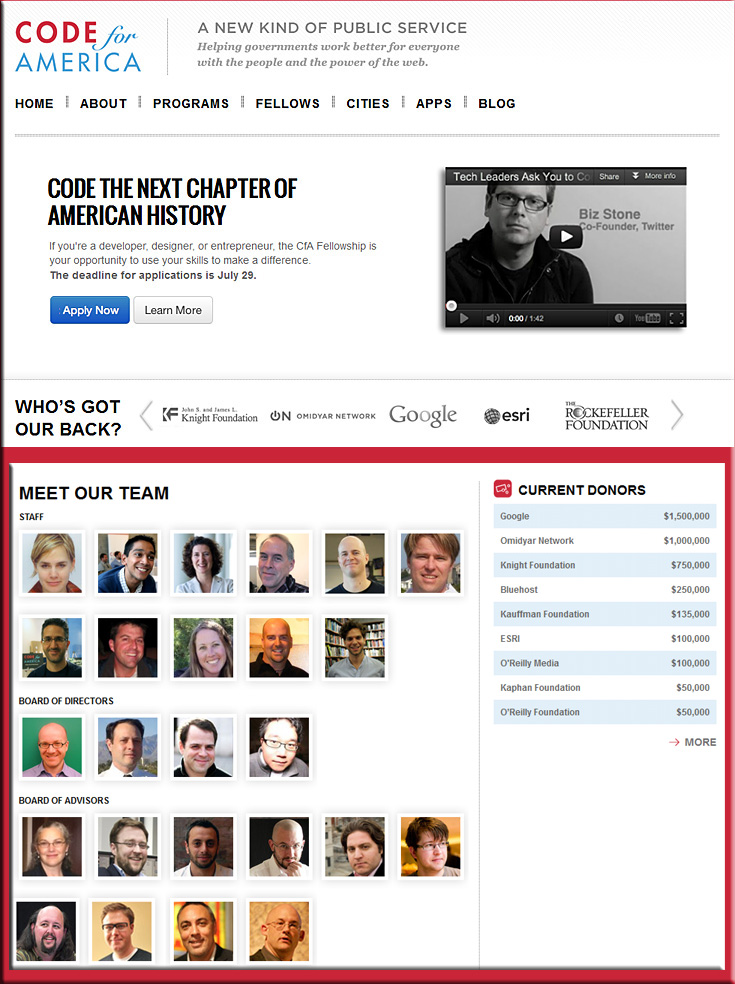
codeforamerica.org

© 2025 | Daniel Christian