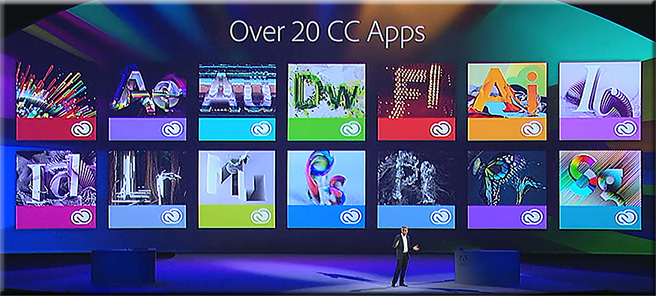
Major update to Adobe Creative Cloud now available — from Adobe
Also see:
- What’s new in Creative Cloud
- Adobe Creative Cloud: everything you need to know — from creativebloq.com
Major update to Adobe Creative Cloud now available — from Adobe
Also see:
60 beautiful examples of websites with full-blown video backgrounds — from hongkiat.com by Nancy Young
.
From DSC:
Yes, you read that right. Video-based backgrounds — motion pictures. Another great example of the convergence that’s been happening with the TV, the telephone, and the computer.
Ten things you should know about WebRTC — from cioinsight.com by Dennis McCafferty
Excerpt:
Don’t you think it would be great if you could engage with customers, employees, and partners accessing voice, video and data-sharing apps on a Web browser without any plug-ins? Thanks to developments with WebRTC technology, this is becoming a reality. To lend greater insight into this topic, Constellation Research Inc. has come out with a recent report, Ten Things CIOs Should Know about WebRTC. In it, author E. Brent Kelly reveals that WebRTC has the potential to take concepts pioneered by programs such as Skype to the next level. Ordinary Web developers will be able to, for example, use basic JavaScript application programming interfaces (APIs) to craft fully functioning voice, video and data-collaboration apps, or embed these capabilities with other apps with just a few lines of code. As a result, CIOs can lead their organizations to greater levels of employee productivity and customer engagement. “WebRTC may prove to be as disruptive to communications and collaboration as the World Wide Web was for information,” says Kelly, a vice president and principal analyst at Constellation.
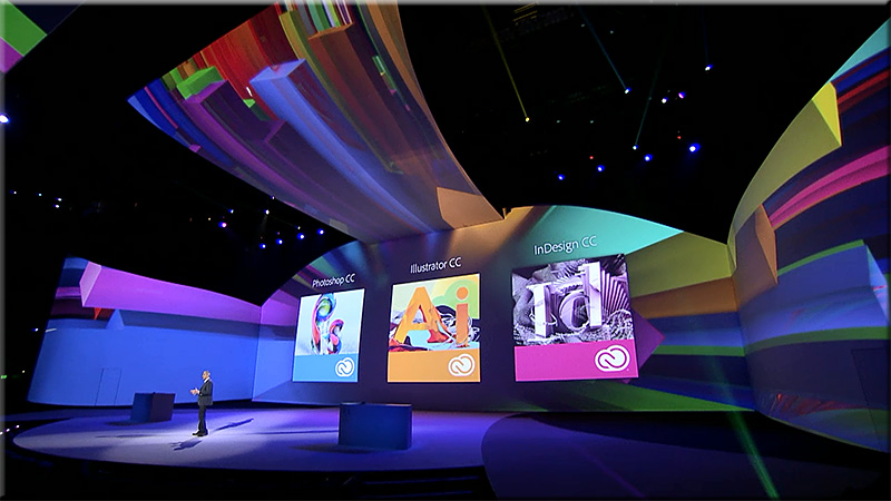
Watch a replay of today’s Adobe MAX 2013 keynote.
Even if you can’t join us in person, you can still connect with the Adobe community. Watch the Adobe MAX 2013 keynotes live from Nokia Theatre L.A. LIVE. We’ll explore the creative evolution – how to use the latest tools to give shape to ideas, and what are the trends that will shape how you’ll work in the future.
A Creative Evolution
Monday, May 6, 9:30-11:30 a.m. PDT
The process of where and how we create is dramatically changing thanks to major advancements in technology, and there has never been a more exciting time. Join Adobe CEO Shantanu Narayen, Adobe’s SVP and GM of Digital Media David Wadhwani, and a collection of Adobe visionaries across digital photography, web design, illustration, video and more as we unveil brand new creative workflows and capabilities. We’ll take a look at the present and set our sights on the endless possibilities in our creative future.
.
.
.
Join us tomorrow at 10 a.m. PDT to watch the keynote – Community Inspires Creativity – live.
10 developer tips to build a responsive website [infographic] — from readwrite.com by Dan Rowinski
Excerpt:
Responsive design is a concept where you build your website once and then format it so it can adapt to any screen size that accesses it. Designers use HTML5 and CSS to build the sites and set parameters so the content will resize itself whether the user is in vertical or horizontal viewing mode, on a tablet, desktop or smartphone or even a screen as large as a television.
Also see:
InDesign FX: How to create a puzzle with InDesign — from blog.lynda.com by Mike Rankin
.
.
Also see:
10 ways the role of web designer is changing — from creativebloq.comby Sush Kelly
From DSC:
In my experience, there are numerous demanding aspects to being or becoming a web designer, as you have to:
The appification of everything will transform the world’s 360 million web sites — from forbes.com by Anthony Wing Kosner
HTML5DevConf – October 2012 — Recordings
Excerpt:
What is the HTML5 Developer Conference?
The HTML5 Developer Conference has become the largest JavaScript and HTML5 developers conference in the world! With a number of varying and expanding approaches, tools, best practices, and advice to be had, there’s a lot of new information to wrap your head around.
We provide tracks on Javascript, HTML5, Apps & Games, client, server, mobile, and more. See leading edge sessions given by renowned speakers…
#DevLearn 2012 Conference Backchannel – Curated Resources — from/by David Kelly
Excerpt:
This post collects the resources shared via the backchannel of The eLearning Guild’s 2012 DevLearn Conference, being held October 31 – November 2 in Las Vegas, Nevada.
I am a huge proponent of backchannel learning. There are many conferences I would love to be able to attend, but my budget can only accommodate one or two each year. The backchannel is an excellent resource for learning from a conference or event that you are unable to attend in-person.
I find collecting and reviewing backchannel resources to be a valuable learning experience for me, even when I am attending a conference in person. Sharing these collections on this blog has shown that others find value in the collections as well.
Some examples:
.
Also see:
HTML 5 cheat sheet — from theultralinx.com
Adobe’s new ‘Edge’ app suite doubles down on HTML — from webmonkey.com by Scott Gilbertson
Excerpt:
Now Adobe is launching a new suite of apps for web developers working with the latest web standards.
The new Adobe Edge suite of HTML5 development tools includes Edge Animate 1.0, a tool to create HTML, CSS and JavaScript-based animations, and Edge Inspect (formerly known as Adobe Shadow), a handy tool for testing your sites on multiple devices at once. There’s also Edge Code, a fork of the Brackets code editor that’s now included in Adobe’s Creative Cloud suite.
As part of the announcement at Adobe’s Create the Web conference in San Francisco the company also showed off a demo of the still-in-development Edge Reflow, a new tool for working with responsive design layouts.
Also see:
What is responsive web design? | infographic — from theultralinx.com
Excerpt:
Many either don’t understand responsive web design or have never heard of it. Responsive web design is essentially one website which can work on many different screen sizes, instead of having one website for the desktop and one website for mobile/tablets. It looks to be the next phase in web design and it’s being adopted quite rapidly with the explosion of mobile phones and tablets.
One or two of you have asked me if I would ever make UltraLinx responsive. I’m currently not looking to do it purely because under 5% of the sites visitors are on mobiles/tablets. Most of people who read UltraLinx, read it on RSS apps such as FLUD or Flipboard. When the time comes to redesign UltraLinx, I will definitely implement responsive web design then.
.
What the heck is responsive web design? — a scrolldeck.js presentation by @johnpolacek
.
Responsive design – harnessing the power of media queries
Webmaster Level: Intermediate / Advanced
Conclusion/excerpt:
It’s worth bearing in mind that there’s no simple solution to making sites accessible on mobile devices and narrow viewports. Liquid layouts are a great starting point, but some design compromises may need to be made. Media queries are a useful way of adding polish for many devices, but remember that 25% of visits are made from those desktop browsers that do not currently support the technique and there are some performance implications. And if you have a fancy widget on your site, it might work beautifully with a mouse, but not so great on a touch device where fine control is more difficult.
The key is to test early and test often. Any time spent surfing your own sites with a smartphone or tablet will prove invaluable. When you can’t test on real devices, use the Android SDK or iOS Simulator. Ask friends and colleagues to view your sites on their devices, and watch how they interact too.
Mobile browsers are a great source of new traffic, and learning how best to support them is an exciting new area of professional development.
Addendums:
Excerpt:
A much-talked-about way to go mobile is responsive design. Some big brands are using this method, and a lot of advocates are calling it the best solution to fit to mobile. But is it really ideal?
It is certainly an option, but it’s extremely case-based and probably rather just functional than ideal. The function of responsive design is simply adjusting all content of the desktop site to any screen size possible. But ultimately, the mobile experience should be for the mobile audience, which is different than the desktop audience. The mobile consumer is usually on the go, which results in very different browsing behavior. Page views and time spent on a site and/or a page are dramatically smaller than for desktop. Responsive design does not recognize the mobile context — it just adjusts the size.
The question is: Is the mobile consumer really going to want to look at all the content your desktop version is now providing? The key to a fast and pleasant mobile experience for the mobile audience is a clear, good-looking and simple design with features that are most important to the user.