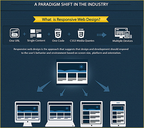
What is responsive web design? | infographic — from theultralinx.com

Excerpt:

Many either don’t understand responsive web design or have never heard of it. Responsive web design is essentially one website which can work on many different screen sizes, instead of having one website for the desktop and one website for mobile/tablets. It looks to be the next phase in web design and it’s being adopted quite rapidly with the explosion of mobile phones and tablets.

One or two of you have asked me if I would ever make UltraLinx responsive. I’m currently not looking to do it purely because under 5% of the sites visitors are on mobiles/tablets. Most of people who read UltraLinx, read it on RSS apps such as FLUD or Flipboard. When the time comes to redesign UltraLinx, I will definitely implement responsive web design then.


.

What the heck is responsive web design? — a scrolldeck.js presentation by @johnpolacek


.

Responsive design – harnessing the power of media queries
Webmaster Level: Intermediate / Advanced

Conclusion/excerpt:

It’s worth bearing in mind that there’s no simple solution to making sites accessible on mobile devices and narrow viewports. Liquid layouts are a great starting point, but some design compromises may need to be made. Media queries are a useful way of adding polish for many devices, but remember that 25% of visits are made from those desktop browsers that do not currently support the technique and there are some performance implications. And if you have a fancy widget on your site, it might work beautifully with a mouse, but not so great on a touch device where fine control is more difficult.

The key is to test early and test often. Any time spent surfing your own sites with a smartphone or tablet will prove invaluable. When you can’t test on real devices, use the Android SDK or iOS Simulator. Ask friends and colleagues to view your sites on their devices, and watch how they interact too.

Mobile browsers are a great source of new traffic, and learning how best to support them is an exciting new area of professional development.


Addendums:

Excerpt:
A much-talked-about way to go mobile is responsive design. Some big brands are using this method, and a lot of advocates are calling it the best solution to fit to mobile. But is it really ideal?

It is certainly an option, but it’s extremely case-based and probably rather just functional than ideal. The function of responsive design is simply adjusting all content of the desktop site to any screen size possible. But ultimately, the mobile experience should be for the mobile audience, which is different than the desktop audience. The mobile consumer is usually on the go, which results in very different browsing behavior. Page views and time spent on a site and/or a page are dramatically smaller than for desktop. Responsive design does not recognize the mobile context — it just adjusts the size.

The question is: Is the mobile consumer really going to want to look at all the content your desktop version is now providing? The key to a fast and pleasant mobile experience for the mobile audience is a clear, good-looking and simple design with features that are most important to the user.

Tagged with:  

HTML5 website showcase: 48 potential Flash-killing demos — from hongkiat.com by Alvaris Falcon; with special thanks going out to Leonard De Rooy, Professor and Chair of Engineering Dept. at Calvin College for this resource/find

Excerpt:

So you’ve heard all rumors about HTML5 would take over Adobe Flash. While most web community argues that it’s possible or not, you must be wandering what makes HTML5 so powerful that even giant company Apple wants to use it to replace Flash.

That’s why this post exists, we’re not going to talk about what HTML5 can do, but show live demos of magical things that HTML5 can achieve with other language like JavaScript, so get ready to be inspired.

Note: As HTML5 is not fully supported by certain web browser like Internet Explorer, you’re strongly recommended to use Firefox browser to view all HTML5 demos below.

Also Len mentioned another interesting item:

Tagged with:  

codeforamerica.org

Plasma First: Apple TV, SmartGlass and the New World of Multi-Screen Cloud Content – from forbes.com by Anthony Wing Kosner

Excerpt:

The future for web developers is big. 50 inch plasma screen big. After an intensive cycle of trying to figure out how to take desktop websites and make them look and work great on mobile devices (often by starting from scratch) the pendulum is swinging to the other end of the multi-screen spectrum—the family TV, the conference room monitor, the classroom SmartBoard.

Also see:

Two browser-related items

Google Chrome overtakes Internet Explorer as the Web’s most used browser — from thenextweb.com by Jon Russell

Excerpt:

Google Chrome has been long expected to leapfrog Microsoft’s Internet Explorer (IE) to take its position as the Web’s most used browser and, according to data from Statcounter, the momentous change of leadership happened last week. The firm’s latest figures — spotted by Global Nerdy blogger Joey deVilla – show that Chrome’s line of usage creeped to overtake IE’s for the first week ever, with Firefox, Safari and Opera completing the top five respectively.

Browser choice: A thing of the past? — from cnet.com by Stephen Shankland
Devices using iOS and the future Windows RT hobble third-party browsers. Despite some good reasons for doing so, the change could undermine browser competition.

Five browser logos
Tagged with:  

Screen resolution & browser trends [infographic] — from theultralinx.com by Oliur Rahman


Tagged with:  

appliness – the first digital magazine for web application developers

.

Addendum on 4/13/12:

  • Java leads programming language popularity – measured by book sales — from readwriteweb.com by Joe Brockmeier
    Excerpt:
    How do you calculate the popularity of various programming languages? The TIOBE folks try to rank programming language popularity by searching the Web. The RedMonk team pulls data from GitHub and Stack Overflow. But O’Reilly has a unique method: It measures book sales as an indicator of technology trends. By that measure, at least, Java and JavaScript come out on top. Mike Hendrickson, O’Reilly’s vice president of content strategy, has been taking a deep dive into the state of the computer book market in a series of posts beginning on March 29th. The most recent is a look specifically at programming language popularity related to sales.
Tagged with:  

HTML5 Cheat Sheet - Tags
.
HTML5 Cheat Sheet - Event Handler Attributes

.
HTML5 Cheat Sheet - Browser Support

From DSC:
Looking at the %’s for browsers overall support of HTML 5, it’s just not there yet…but it’s making progress. I’ll try to pulse-check this from time to time.
Tagged with:  

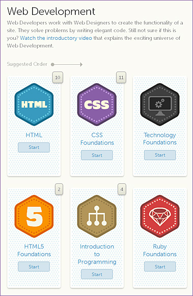
treehouse.com -- learn web design, web development, and iOS development

.


.


.


The Right Shade of Autumn– from Yanko Design
Advisor: Wen-Chih Chang | Designer: Liao-Hsun Chen

Excerpt:

Color Elite is…[a] combination of e-paper technology, a camera and the Internet. Together they combine to provide you the exact shade or colors you are looking for, and even help reduce the use of paper.


.

Tagged with:  

Defending the Generalists in the Web Design Industry — from Smashing Magazine by Paul Boag

Excerpt:

In recent years there has been a move away from generalist Web designers to specialists such as content strategists, user experience architects and front-end coders. Where once there was a single job, there are now many, with ever-narrower spheres of responsibility.

While my peers are becoming more specialized, I have stoically refused to do so, remaining a generalist. If anything, my interests have broadened, encompassing subjects such as marketing, psychology and business strategy.

This has drawn criticism from some who view generalists negatively, which is in line with some of what I am reading in the blogosphere.

Where has this negativity come from, and is it justified?

From DSC:
This is a great writeup of the pro’s and con’s, benefits and drawbacks of being a generalist in the web design industry.  My experience with web design and production is that it has been extremely difficult to keep up over this last decade — especially when one can not focus solely on web design and production in one’s daily tasks.  For example, I’ve had to redirect my resources/energies into other areas, tools, pedagogies, learning theories, trends, systems-related projects, management, etc. — leaving little time to try to keep up with advances and changes within the arenas of front-end design and back-end development. I’ve been forced to be a generalist as well — but a few levels up.    🙂


Report: The most common web browsers and browser versions today — from royal.pingdom.com


Browser logos


Excerpt from this 6/16/11 posting:

The web browser market is an ever-changing landscape. It can sometimes be rocky ground for web designers and web developers trying to make their websites and services work for all the various browser versions available out there. It’s challenging work, to say the least.

That’s why it pays to be aware of what the web browser market looks like, and stay up to date. How many are using the various browsers out there? How many are using the latest versions? Which versions are the most common? How big an audience may you be annoying if your site isn’t perfect in a specific browser version?

Those are all questions you’ll want to answer, and here is what the situation looks like right now, in June 2011, based on the traffic to more than three million websites and billions of page views.

Tagged with:  

Useful HTML-, CSS- and JavaScript Tools and Libraries –from SmashingMagazine.com

Excerpt:

Front-end development is a tricky beast. It’s not difficult to learn, but it’s quite difficult to master. There are just too many things that need to be considered; too many tweaks that might be necessary here and there; too many details to make everything just right. Luckily, developers and designers out there keep releasing useful tools and resources for all of us to learn, improve our skills and just get better at what we do. Such tools are valuable and helpful because they save our time, automate mundane tasks and hence help us focus on more important things.

Here at Smashing Magazine, we’re continuously searching for time-saving, useful HTML-, CSS- and JavaScript-resources for our readers, to make the search of these ever-growing tools easier. We hope that these tools will help you improve your skills as well as your professional workflow. A sincere thanks to all designers and developers who are featured in this round-up. We respect and appreciate your contributions to the design community.

Tagged with:  

How HTML5 will transform the online video landscape — from Mashable.com by Christina Warren


33 essential resources for developers & designers — from Mashable.com by Brian Anthony Hernandez

For months now, web developers and designers have flocked to Mashable to learn from and share our how-to guides, analyses, videos, lists, videos and galleries. Below, we’ve assembled 33 of our favorite resources since January and separated them into three easily digestible lists: inspiration, design and development. To keep up to date with news and resources about the topics listed below, feel free to follow Mashable‘s dev & design channel on Twitter…

Tagged with:  
© 2024 | Daniel Christian