Artist Niyoko Ikuta uses layers of laminated sheet glass to create spiraling geometric sculptures — from thisiscolossal.com by Christopher Jobson
Is ‘Design Thinking’ the New Liberal Arts? — from chronicle.com by Peter N. Miller
Excerpt:
What is design thinking? It’s an approach to problem solving based on a few easy-to-grasp principles that sound obvious: “Show Don’t Tell,” “Focus on Human Values,” “Craft Clarity,” “Embrace Experimentation,” “Mindful of Process,” “Bias Toward Action,” and “Radical Collaboration.” These seven points reduce to five modes — empathize, define, ideate, prototype, test — and three headings: hear, create, deliver. That may sound corporate and even simplistic, but design thinking has been used to tackle issues like improving access to economic resources in Mongolia, water storage and transportation in India, and elementary and secondary education and community building in low-income neighborhoods in the United States.
John L. Hennessy, president of the university, and David Kelley, head of the d.school, have been having a conversation about what the d.school and design thinking mean for Stanford. Hennessy sees them as the core of a new model of education for undergraduates. Two such classes on design thinking have already been created: “Designing Your Life,” which aims to help upperclassmen think about the decisions that will shape their lives after graduating, and “Designing Your Stanford,” which applies design thinking to helping first- and second-year students make the best choices about courses, majors, and extracurricular activities. Both are popular. Kelley argues for incorporating design thinking into existing courses across the humanities and sciences.
One size doesn’t fit all innovation — from innovationexcellence.com by Ralph Ohr
Excerpt:
Design Thinking also focuses on understanding the needs of potential customers outside the building. But its motivations and tactics are different from those of Customer Development. Design Thinking doesn’t start with a founder’s vision and a product in-hand. Instead it starts with “needs finding” and attempts to reduce new product risk by accelerating learning through rapid prototyping. This cycle of Inspiration, Ideation and Implementation is a solutions-based approach to solving customer problems. Design Thinking is perfectly suited to situations where the process isn’t engineering-driven; time and money are abundant and the cost (and time) of a failure of a major project launch can be substantial. This process makes sense in a large company when the bets on a new product require large investments in engineering, a new factory or spending 10s or 100s of millions on launching a new product line.
…
Design Thinking is based on properly understanding customer needs and iteratively prototyping to meet those needs with a satisfying solution. It primarily aims at doing the right things (i.e. serving a well-understood need properly) before investing time and resources.
What is Design Thinking? [Infographic] — from smashfreakz.com
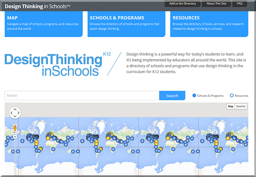
Design Thinking in Schools
Design thinking is a powerful way for today’s students to learn, and it’s being implemented by educators all around the world. This site is a directory of schools and programs that use design thinking in the curriculum for K12 students.
This site has been put together by IDEO and the K12 Lab Network at Stanford’s d.school. Over the years we have seen so many schools and programs create amazing experiences for youth, helping them get in touch with their “inner designer” and build confidence in their creative abilities. With more and more programs emerging around the world, we wanted a place where we could see the global movement unfold, we wanted parents to find programs to send their kids to, and we wanted teachers and administrators to be able to find like-minded colleagues with they could connect.
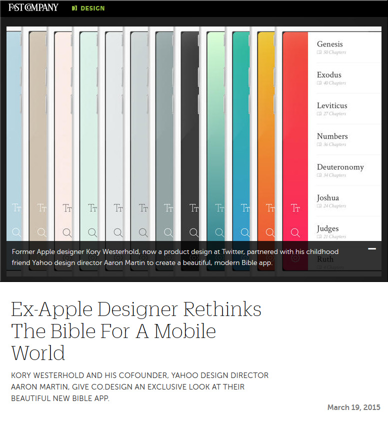
Ex-Apple designer rethinks the Bible for a mobile world — from fastcodesign.com by Ainsley O’Connell
Kory Westerhold and his cofounder, Yahoo design director Aaron Martin, give Co.Design an exclusive look at their beautiful new Bible app.
Excerpt:
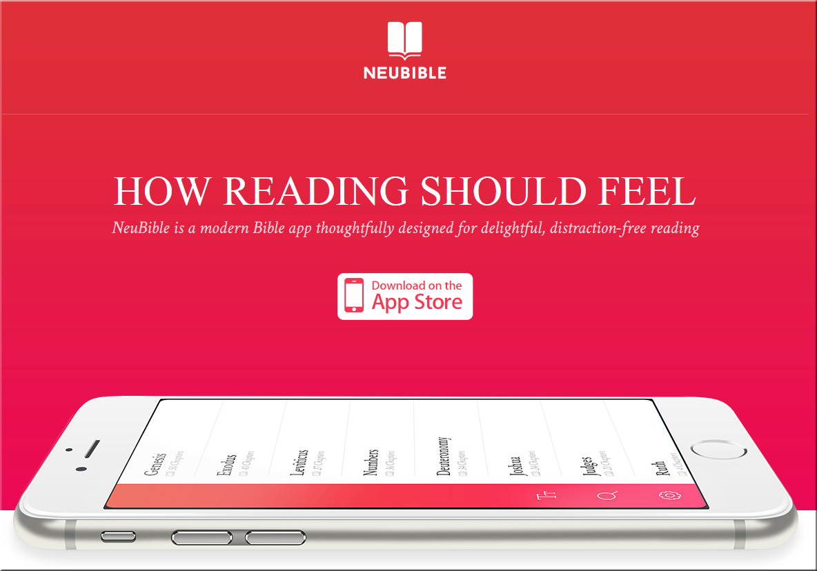
Fast-forward to 2015, and Westerhold, now a product designer at Twitter, has teamed up with Aaron Martin, a design director at Yahoo and childhood friend. Today, after months of sketching and development, they released NeuBible, an elegant and radically simplified mobile app for the Bible.
Their goal, Westerhold says, was to “get rid of everything between you and scripture.”
Also see:
Published on Mar 15, 2015
Description (emphasis DSC):
Design has become a game changer in Silicon Valley. Last year, John Maeda joined KPCB as the firm’s first Design Partner, joining from his role as the President of the Rhode Island School of Design. Now, in his inaugural #DesignInTech Report, Maeda highlights the rising importance of design in the entrepreneurial ecosystem. Drawing on extensive research and his own conversations with hundreds of designers, Maeda examines the intersection of design and technology. The report covers trends ranging from the record amounts of funding flowing into design-led startups to M&A activity with major tech corporations. Beyond designers and technologists, the report will appeal to a broad audience. For all of us who use a computer or mobile device, great design is changing how we live and work. This report helps explain why.
Nine creative firms have been atypically acquired by companies known for tech like Facebook, Flextronics, Googe, and GlobalLogin; also Accenture and Capital One.
Tech companies, and investors, are increasingly seeing the value of designers who know how to work with and within the constraints of the tech industry.
Design in VC is not about pretty — it’s about relevance.
Also see:
The Big Web Design Trends for 2015 — from sitepoint.com by Joanna Krenz Kurowska; with thanks to Mr. Tim Pixley for this resource
Excerpt:
When thinking about web design, you must consider the full spectrum of possibilities that the internet presents. Done boldly, designers can push the current limits of human interaction and imagination on a global scale – as is often seen with edgier industries, such as creative agency websites.
In this article, we’ll boil down some of the most prominent web design trends emerging in 2015. It is here that we can find true innovation and new opportunities – a few of which may completely change our understanding of a “modern website”.
8 design trends for 2015 — from istockphoto.com by Rebecca Swift
Web design trends that will rule 2015 — from designmodo.com by Tomas Laurinavicius
Excerpt:
Web design is a vibrant and diverse industry that is changing and evolving quickly. Website design is, however, not an end product; it’s an asset in the presentation of a product, connecting people with other people, providing a tool or service.
After reviewing over 500 websites in weekly series of “Inspiring Sites of the Week” on Despreneur I’ve got a sense of where web design is and where it is going for the next year. In this post I will try to review the current status of web design and predict some trends for 2015.
These are my assumptions and guesses based on my research and experience designing in 2014. Some of these may be right some may be not. If you think there should be something more in this article I’d love to have a discussion with you.
The trends in web design for 2015 [infographic] — from techinfographics.com by by Josipa Štrok
Excerpt:
The way we use the web is changing in line with the growth of technology. Smartphones and tablets have become a major factor which influencing the design of the web. What are the trends in web design for 2015?
If content is king, then the design is the crown. Home page should be more comprehensive. Visitors must get a sense of intuitive and dynamic interaction. Responsive design of website remains still imperative. Every owner who cares for his visitors should have designed a website that includes technology to automatically adjust the content to the devices where they are read. In the future responsive design will adapt to smart TVs and smart watches, not only monitors, smart phones or tablets. Moving page should be vertical because it contributes to an interactive style stories. After all this way scrolling through content is much easier to use on smartphones / tablets than clicking on the navigation from page to page. Forget the shadows, patterns and textures. Style with simple lines and white space is recommended for the coming year.
Using Design Thinking in Higher Education — from educause.com b
Design thinking focuses on users and their needs, encourages brainstorming and prototyping, and rewards out-of-the-box thinking that takes “wild ideas” and transforms them into real-world solutions.
Excerpt:
Albert Einstein famously said, “No problem can be solved by the same kind of thinking that created it.” So, assuming we agree, what exactly are our alternatives? How can we go beyond our standard approach to problems in higher education and entertain new possibilities? One promising alternative is to engage in design thinking.
Design thinking offers a creative yet structured approach for addressing large-scale challenges. In September 2014, we conducted an EDUCAUSE webinar, Design Thinking: Education Edition, and offered examples from our Breakthrough Models Incubator (BMI).
Here, we offer a summary of that webinar, discussing design thinking principles and process, describing real-world examples of design thinking in action, and offering possibilities for how you might introduce the approach into your own organization.
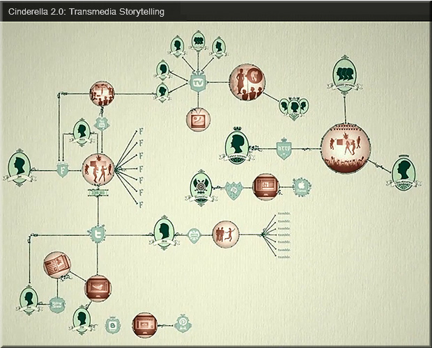
Mesmerizing fairy tale on the power of transmedia storytelling — from frametales.com by DRAFTFCB Madrid and posted by Filip Coertjens; with thanks to the Scoop on this from Laura Fleming (@NMHS_lms)
BBC iWonder: Introducing Interactive Guides — from bbc.co.uk by Andrew Pipes
See this piece as an example of what they’ve come up with.
Interactive guides on three screens
The BBC article also pointed to a bit older,
but very creative piece from the NYT entitled:
Snow Fall
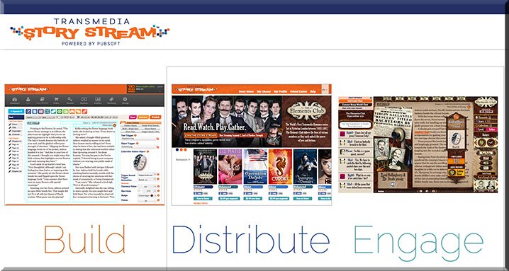
Transmedia Story Stream: Don’t just read a book–play it! — from bleedingcool.com by Dan Wickline; with thanks to Digital Rocking Chair for the Scoop on this
Excerpt:
Instead of downloading a static book, Transmedia Story Stream allows readers to log into story worlds filled with fans, activities, and extended narrative that can include video, audio, casual video games or live gatherings. And just like in a video game, the book will award fans for participating in the story. Fans can earn points and badges, collect digital goodies to share, earn money for spreading word of mouth, participate in a live chat with an author or illustrator right in the book or win a phone call with a character in a story.
Also see:
Design & Screen-Based Learning in Higher Education — from higheredmanagement.net by Keith Hampson
Excerpt (emphasis DSC):
But the migration from the classroom to a screen-based environment is a change like no other. It’s a migration to a design-dependent environment. The digital learner’s experience is highly-dependent on the quality of design. The particular mix of colors, layout, audio, animation, words per page and other design elements can make the difference between a good and bad experience for learners on laptops, smartphones and tablets.
To date, digital higher education has largely ignored the role of design in online learning. It’s not part of the conversation. You’ll be lucky to find it discussed at conferences or in journals. This is partly because good design practices are not part of most institutions’ DNA. (Have you ever tried to find your way around an unfamiliar campus? Signage, anyone?). And partly because institutions often frame aesthetics and related matters as enemies of science.
Excerpt:
Design, the discipline, is about the construction of interfaces that match the abilities and needs of people and technology in order to make products and services effective, understandable and pleasurable.
Design is also is about innovation, experimentation, about pushing the envelope of what can be done.
From DSC:
My wife had purchased a few things at the store the other day, including the plastic plate below. So when I reached for a smaller plate and grabbed hold of this one, I stopped and stared for a moment at it. Then my kids heard me say, “This is great design!” After that, I literally had to stop, put it on the counter, and take a picture of it so I could post it on this blog. The design is so simple, so straightforward, and yet so functional. I don’t have to remember what all the food groups are — they are right there for me to “fill up.” Great, minimalist design. Simple, yet still very effective.
.
Half of us may soon be freelancers: 6 compelling reasons why — from LinkedIn.com by Shane Snow
Excerpts (emphasis DSC):
The cost savings and flexibility of a non-salaried workforce often make business sense, but the model requires the workers to suddenly become businesspeople. We wanted to help our writer and editor friends continue doing what they were good at, without having to deal with the stress of finding work, getting paid on time, and marketing themselves on their own. And we were not the only ones who saw the wave coming. Communities for designers and other creative talent have helped these freelancers make it on their own for several years now.
…
And where it’s clear that the majority of creative people will be freelance before long, all signs point to other jobs one day following suit. This will mean huge things for the domestic and global economy, and it will give an enormous number of people increased flexibility, responsibility, and stress.
Freelancers are de-facto entrepreneurs, which means all of us need to learn to think and act like startups.
From DSC:
This is why I think we should help our youth develop their own businesses — or at least have some exposure to running their own business. In high school and in college, we should help our youth begin their own businesses, driven by their passion for a particular discipline/area. The business may or may not make it — that’s not the point. They need to get their feet wet with experimentation, entrepreneurship, business fundamentals, innovating, and pivoting.
Other articles that corroborate the main point I — and the above author — are trying to get at:
From article on gigaom.com
The company (oDesk) also released other stats in an infographic, including these factoids:
.
Addendum on 8/15/13: