Research Posters Are a Staple of Academic Conferences. Could a New Design Speed Discovery? — from edsurge.com by Jeff Young
Excerpts:
Scholars around the world share their latest research findings with a decidedly low-tech ritual: printing a 48-inch by 36-inch poster densely packed with charts, graphs and blocks of text describing their research hypothesis, methods and findings. Then they stand with the poster in an exhibit hall for an hour, surrounded by rows of other researchers presenting similar posters, while hundreds of colleagues from around the world walk by trying to skim the displays.
…
Not only does the exercise deflate the morale of the scholars sharing posters, the ritual is incredibly inefficient at communicating science, Morrison argues.
…
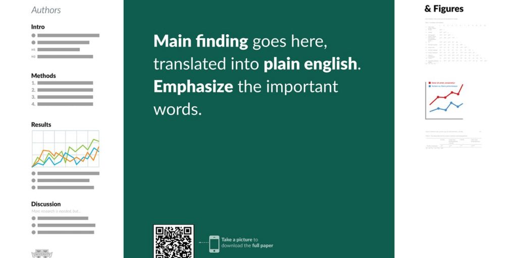
Morrison says he has a solution: A better design for those posters, plus a dash of tech.
To make up for all the nuance and detail lost in this approach, the template includes a QR code that viewers can scan to get to the full research paper.
From DSC:
Wouldn’t this be great if more journal articles would do the same thing? That is, give us the key findings, conclusions (with some backbone to them), and recommendations right away! Abstracts don’t go far enough, and often scholars/specialists are talking amongst themselves…not to the world. They could have a far greater reach/impact with this kind of approach.
(The QR code doesn’t make as much sense if one is already reading the full journal article…but the other items make a great deal of sense!)


