What is ADA Website Accessibility? — from boia.org

Excerpt:

If you’re confused about ADA website compliance, you’re not alone. According to a 2021 report from non-profit organization WebAIM (Web Accessibility In Mind), 97.4% of the top one million home pages on the internet have detectable accessibility issues — and many of those issues could be interpreted as violations of the Americans with Disabilities Act (ADA).

Under the ADA, businesses and public agencies must provide reasonable accommodations to persons with disabilities in “places of public accommodation.” That certainly applies to websites, as the Department of Justice has repeatedly confirmed.

Addendum on 3/28/22:


Web Accessibility on a Budget: How to Get Started for Free or Little Cost — from boia.org

Excerpt:

How to improve web accessibility for little to no cost:

  • Get a free accessibility assessment.
  • Learn what accessibility updates you can make yourself.
  • Use free assistive technology and accessibility tools.
  • Read content and continue learning from the accessibility community.
  • Publish an accessibility statement.
  • Create a long-term plan to full accessibility compliance.

Also related/see:  The #accessibilityChecker hashtag on Twitter.


What Makes a Great School Website Design [with Practical Tips and Examples] -- from graphicmama.com by Boril Obreshkov

What Makes a Great School Website Design [with Practical Tips and Examples] — from graphicmama.com by Boril Obreshkov

Excerpt:

A school website is much more than means to list information online. It’s the front gate to your school community, representing its values and philosophy. A well-made school website design and structure can help build a reputation for the institution, create an entire concept for how first-time visitors will view it, and ultimately give the school an advantage over competitor schools. In this article, we’ll talk about what makes a great school website, with many examples and practical tips on how to improve your virtual hub of knowledge!

Things Great School Websites
Have in Common >>

Also relevant/see:

Digital branding is key for everyone in education — from thetechedvocate.org by Matthew Lynch

Excerpt:

People in the educational sector tend to face lots of competition. Currently, there are tons of colleges, universities, and most training centers. This means that there’s a high need for everyone in education to venture into the building and create a unique identity for their brands. In this way, people can have the opportunity to stay ahead of their competitors in a tangible manner.

One way that this can be achieved is through educational digital branding. It’s a cost-effective and more efficient means of targeting the right audience. In this piece, we will talk about how you can implement digital branding, especially in education.

You are using your school website wrong — from thetechedvocate.org by Matthew Lynch

Excerpt:

Part of the problem is that developing and maintaining a useful school website is quite a big undertaking but isn’t super urgent. Because of this, it often falls through the cracks. Another issue can be ownership of the project.

Let’s take a look at some of the most common mistakes made when designing and keeping school websites.


What’s new on the WCAG 3.0 working draft? (December 2021) — from uxdesign.cc by Daniel Berryhill
AGWG just released a new Working Draft for WCAG 3.0. Let’s see what’s new.

Excerpt:

While the Accessibility Guidelines Working Group (AGWG) is still working on getting WCAG 2.2 finalized, they are also working on the upcoming WCAG 3.0 standards.

[On December 7th, 2021], they released a new Working Draft of WCAG 3.0. We’ll go over the changes made from the previous Working Draft that came out in June 2021.


28 Website Accessibility Terms to Know in 2022 — from blog.hubspot.com by Jamie Juviler

Excerpt:

No matter the type of website you run or the industry that you’re in, prioritizing web accessibility is key to your success.

To ensure your website meets today’s standards for web accessibility, you’ll first need to understand the terminology. Accessibility is a big, dense area with a lot of jargon, acronyms, and codes — enough to steer a new website owner away from the topic altogether.

That’s why we’ve put together this glossary of 28 essential web accessibility terms any website owners should be aware of. By knowing the language, you’ll find it much easier to adopt accessibility principles on your own site and better serve visitors with disabilities.

Addendum on 12/31/21:

Accessibility awareness is on the rise, but is it turning into action? — from techcrunch.com by Joe Devon

Excerpts:

Harris Poll reveals that more than half of American adults increased their online activities because of the pandemic. That number grows to 60% for people with disabilities.

The increase in online activities does not mean that everyone is able to achieve their goals. So, what kind of impact is the crisis having on accessibility? Are organizations finally getting the message on the importance of accessibility?

With that, here are the key results from the Alexa top 100 website testing:

    • Out of the websites tested, 62% were accessible to screen readers, up from 40% in 2020.
    • Every single page passed for having the valid document “lang” attribute.
    • Only 11% of websites tested had errors in input field labels.
    • The most common error was the use of ARIA (Accessible Rich Internet Applications specification)
    • The second most common error was color contrast.

From DSC:
That last article linked to:


15 best new fonts, December 2021 — from webdesignerdepot.com by Suzanne Scacca

Excerpt:

Are you tired of using the same old Google fonts from website to website? You’re in luck!

In this month’s roundup of the best new fonts, we’re showcasing the latest and greatest fonts from independent type foundries and designers worldwide.


10 Best Accessibility Tools For Designers — from hongkiat.com by Hongkiat Lim

Excerpt:

Today is the world of inclusive technology – websites, apps, and tech gadgets that are made for people with different kinds of abilities and inabilities. So when you’re designing a website, you include features that make your design accessible to as many people as possible. And this is where accessibility tools come into play.

Instead of creating everything from scratch, here’s a list of cool accessibility tools for designers. From creating color combinations according to WCAG standards to adding different reading modes to your website, these tools are a must-haves for every designer. Take a look at the list to know about each tool in detail.


Nalukai Academy: Harvesting Hawai’i’s Next Generation of Leaders — from gettingsmart.com by Ashley Ranan

Excerpt:

Nalukai’s program curriculum includes 5 areas of interest:

  • Digital storytelling – branding & marketing, content creation, web design
  • Leadership – project management, collaboration, team dynamics
  • Entrepreneurship – networking, investor pitches, business plan development
  • Design thinking –  prototyping, mind-mapping, iteration
  • Technology – coding, web development, digital business tools

Also see:

The Nalukai Academy offers intensive tech, entrepreneurship, leadership, and design programs for Hawai?i high school students. This image portrays some of those students.


Thursday, 5/20/21, is Global Accessibility Awareness Day!!!

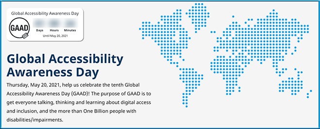
Global Accessibility Awareness Day is this Thursday, May 20, 2021
Help us celebrate the tenth Global Accessibility Awareness Day (GAAD)! The purpose of GAAD is to get everyone talking, thinking and learning about digital access and inclusion, and the more than One Billion people with disabilities/impairments.

Global Accessibility Awareness Day is is Thursday, May 20th 2021

Also see:

Global Accessibility Awareness Day is Thursday, May 20, 2021


History of the Web Content Accessibility Guidelines (WCAG) –from boia.org

Excerpt:

What is WCAG?
WCAG is a set of specific standards designed to make the web more accessible to people with disabilities. It is on its third version, updated over the years to account for changes in web-based digital technology, assistive technology, design and development trends, and the growth of the mobile web. It is published by the World Wide Web Consortium (W3C) Web Accessibility Initiative (WAI) in collaboration with individuals and organizations within the global accessibility community according to the W3C Process.

Also see:

‘My Experience Was Compliant’ Said No One Ever. Accessibility increases the joy of a web experience.


Improving Digital Inclusion & Accessibility for Those With Learning Disabilities — from inclusionhub.com by Meredith Kreisa
Learning disabilities must be taken into account during the digital design process to ensure digital inclusion and accessibility for the community. This comprehensive guide outlines common learning disabilities, associated difficulties, accessibility barriers and best practices, and more.

“Learning shouldn’t be something only those without disabilities get to do,” explains Seren Davies, a full stack software engineer and accessibility advocate who is dyslexic. “It should be for everyone. By thinking about digital accessibility, we are making sure that everyone who wants to learn can.”

“Learning disability” is a broad term used to describe several specific diagnoses. Dyslexia, dyscalculia, dysgraphia, nonverbal learning disorder, and oral/written language disorder and specific reading comprehension deficit are among the most prevalent.

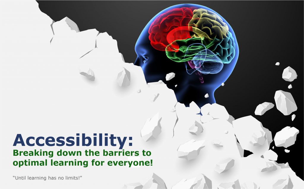
An image of a barrier being torn down -- revealing a human mind behind it. This signifies the need to tear down any existing barriers that might hinder someone's learning experience.


Moving Online Learning from Challenge to Opportunity — from campustechnology.com by Dr. Mark Lombardi
The future of higher education means breaking down classroom walls, embracing digital tools and engaging students with creativity and innovation.

Excerpt (emphasis DSC):

Similarly, Maryville criminology professor Geri Brandt, working in concert with our learning designers and on-site production studio, used 360-degree camera technology to stage a virtual, explorable, interactive crime scene. Extending this online experience further, the criminology department created a “choose your own adventure” virtual experience, where each student response or choice in an investigation leads to a different outcome.

Creativity and innovation on this scale are only possible when faculty work with a talented team of learning design professionals who can translate a vision of interactive and immersive learning into a new student experience. Designing and delivering this active learning ecosystem integrated in online and on-ground learning takes a team of committed professionals and the courage to make it happen.

What if students could choose to learn in environments that are fully immersive, deeply enriching and profoundly meaningful to their courses of study? We encourage our students to explore the world beyond the campus, but what happens when the world is your campus?


Navigating website ADA compliance: ‘If you have videos that are not captioned, you’re a sitting duck’ — from abajournal.com by Matt Reynolds

Excerpts:

“If you have videos that are not captioned, you’re a sitting duck,” Goren said. “If you’re not encoding your pictures so that the blind person using a screen reader can understand what the picture is describing, that is a problem.”

Drop-down boxes on websites are “horrible for accessibility,” the attorney added, and it can be difficult for people with disabilities to navigate CAPTCHA (Completely Automated Public Turing test) technology to verify they are human.

“Trying to get people with voice dictation or even screen readers to figure out how to certify that they’re not a robot can be very complicated,” Goren said.

Also see:

Relevant Laws

Information re: Lawsuits


Effective and Accessible Alternatives to Website Carousels — from boia.org on February 11, 2021

Excerpt (emphasis DSC):

Real estate on a web page is precious. Every web designer or marketer at some point has felt that there simply isn’t enough space to show all the content they want to show. The carousel offered an apparent solution to that problem by cramming several content pieces into the same space, rotating to be individually visible either automatically or by the user’s control. The ability to show more content in less space in a way that looked cool made carousels attractive and they can now be seen all over the web. They’d be a great idea if it weren’t for two big problems: they don’t work and they aren’t accessible.

About 1% of people click on carousels.

Carousels are now associated with ads or junk content.

 
© 2024 | Daniel Christian