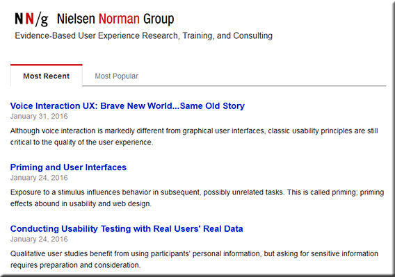
Top 20 User Experience Blogs and Resources of 2015 — from usabilitygeek.com by Matt Ellis

Example resources from that posting:


ux-design-feb2016


ux-design2-feb2016


ux-design3-feb2016

BONUS: 15 Honorable Mentions

The following is a list of other excellent user experience blogs that did not make it in this list but are so good that they are still worth a mention. So please be sure to check them out as well!


From DSC:
Though I’m sure this list is missing many talented folks and firms, it’s a great place to start learning about user experience design, interface design, interaction design, prototyping, and usability testing.


Holograms are coming to a high street near you — from telegraph.co.uk by Rebecca Burn-Callander
Can you tell what’s real and what’s not?

Excerpt:

Completely realistic holograms, that will be generated when you pass a sensor, are coming to the high street.

Some will be used to advertise, others will have the ability to interact with you, and show you information. In shops, when you find a shirt you like, the technology is now here to bring up a virtual clothes rail showing you that same shirt in a variety of colours, and even tell you which ones are in stock, all using the same jaw-dropping imaging we have previously only experienced wearing 3D glasses at the cinema.

Holograms, augmented reality – which superimposes technology over the real world – and virtual reality (VR), its totally immersive counterpart, are tipped to be the hot trends in retail next year. Pioneers of the technology are set to find increasingly entertaining, useful and commercially viable ways of using it to tempt people into bricks-and-mortar stores, and fight back against the rise of online shopping.


WaveOptics’ technology could bring physical objects, such as books, to life in new ways


Completely realistic holograms, that will be generated when you pass a sensor, are coming to the high street.


From DSC:
What might our learning spaces offer us in the not-too-distant future when:

  • Sensors are built into most of our wearable devices?
  • Our BYOD-based devices serve as beacons that use machine-to-machine communications?
  • When artificial intelligence (AI) gets integrated into our learning spaces?
  • When the Internet of Things (IoT) trend continues to pick up steam?

Below are a few thoughts/ideas on what might be possible.

A faculty member walks into a learning space, the sensors/beacons communicate with each other, and the sections of lights are turned down to certain levels while the main display is turned on and goes to a certain site (the latter part occurred because the beacons had already authenticated the professor and had logged him or her into the appropriate systems in the background). Personalized settings per faculty member.

A student walks over to Makerspace #1 and receives a hologram that relays some 30,000-foot level instructions on what the initial problem to be solved is about. This has been done using the student’s web-based learner profile — whereby the sensors/beacons communicate who the student is as well as some basic information about what that particular student is interested in. The problem presented takes these things into consideration. (Think IBM Watson, with the focus being able to be directed towards each student.) The student’s interest is piqued, the problem gets their attention, and the stage is set for longer lasting learning. Personalized experiences per student that tap into their passions and their curiosities.

The ramifications of the Internet of Things (IoT) will likely involve the classroom at some point.  At least I hope they do. Granted, the security concerns are there, but the IoT wave likely won’t be stopped by security-related concerns. Vendors will find ways to address them, hackers will counter-punch, and the security-related wars will simply move/expand to new ground. But the wave won’t be stopped.

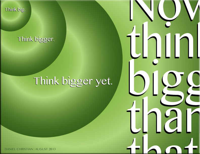
So when we talk about “classrooms of the future,” let’s think bigger than we have been thinking.


ThinkBiggerYet-DanielChristian-August282013


Also see:

What does the Internet of Things mean for meetings? — from meetingsnet.stfi.re by Betsy Bair

Excerpt:

The IoT has major implications for our everyday lives at home, as well as in medicine, retail, offices, factories, worksites, cities, or any structure or facility where people meet and interact.

The first application for meetings is the facility where you meet: doors, carpet, lighting, can all be connected to the Internet through sensors. You can begin to track where people are going, but it’s much more granular.

Potentially you can walk into a meeting space, it knows it’s you, it knows what you like, so your experience can be customized and personalized.

Right now beacons are fairly dumb, but Google and Apple are working on frameworks, building operating systems, that allow beacons to talk to each other.


Addendum on 1/14/16:

  • Huddle Space Products & Trends for 2016 — from avnetwork.com by Cindy Davis
    Excerpt:
    “The concept is that you should be able to walk into these rooms, and instead of being left with a black display, maybe a cable on the table, or maybe nothing, and not know what’s going on; what if when you walked into the room, the display was on, and it showed you what meeting room it was, who had the meeting room scheduled, and is it free, can just walk in and I use it, or maybe I am in the wrong room? Let’s put the relevant information up there, and let’s also put up the information on how to connect. Although there’s an HDMI cable at the table, here’s the wireless information to connect.
 

The next phase of UX: Designing chatbot personalities — from fastcodesign.com by
When the conversation is the interface, experience design is all about crafting the right words.

Excerpt:

You may have heard that “conversational interfaces” are the new hotness in digital product design. Why open and close a bunch of apps on your phone to get stuff done when you can invoke a text-message-like window and just say what you want done to a chatbot? Well, here’s one reason: what if the bot is annoying or tedious to talk to? In conversational UIs, personality is the new UX.


Five ways businesses need to rethink UX in 2016 — from information-age.com by Chloe Green
How can businesses keep pace with customer expectations of their online experiences? Digital technologies are evolving fast, and with them user experience expectations.

Excerpt:

In today’s technology-driven world, the task of keeping customers happy is a constantly moving target. Not least because customer expectations of their digital interactions with a business are continually evolving.
Therefore, keeping pace with the changing expectations that customers have of their online user experience (UX), has never been more important.
Yet even digitally savvy organisations may not yet be prepared to make the necessary UX improvements to ensure they are meeting changing customer expectations in 2016. So, what are the five considerations that must be made to enable businesses to keep pace with customer expectations of their online experiences?

“Once the things in the IoT are connected and given a voice, they become more than just ‘things.’ They become part of a living experience shaped by interactions among people, places, and objects, among product, nature, and life,” said Olivier Ribet, VP of High Tech for Dassault Systemes. “They become contributors to what beckons just beyond the IoT: the Internet of Experiences. Earning a piece of the Internet of Experiences requires a higher level of strategic thinking-or Experience Thinking-but the returns promise to be higher as well.”


How the Internet of Things changes traditional design and user experience — from huffingtonpost by Phil Simon

Excerpt:

Make no mistake: Design is no longer an afterthought at progressive organizations. Companies are hiring highly paid user-experience experts en masse–a trend that will only intensify as the Internet of Things (IoT) arrives.


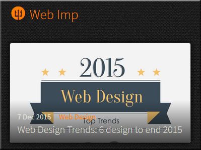
Web design trends: 6 designs to end 2015 — from webimp.com.sg


6designstoend2015-web-imp


Be careful about these 6 web design trends in 2016 — from awwwards.com
Are Hamburger Menus, Parallax Scrolling and Complex Typography a help or a hindrance?

Excerpt:

Trends in web design, like fashion trends, come and go. Sometimes trends are dictated by necessity (like responsive design). Other trends are industry shifts, such as the change from skeuomorphism to flat design.

The decision to follow a trend must depend on the needs of your users and your business. The decision should never be based solely on “it’s what the cool sites are doing”. Fads fade. A site built only on trends quickly becomes out of date.

With that in mind, let’s look at the design trends that you might want to think twice about using.


Top web design trends for 2016 — from creativebloq.com
We round up the hottest web design trends set to dominate 2016.

Excerpt:

Just like any other field of design, web design trends come and go with the passing of time. Unlike many other fields, however, web design has a relentless driver to change: technology. Because the basis of the platform is ever changing, some of the trends in design for the web are as a result of improvements to what’s possible as much as a reflection on changing taste.

2015 has been an interesting year in terms of web design. The visual landscape for web designers has remained largely as it was in 2014, with only a refinement of the minimalist approach that has become popular over the past few years. Underneath the aesthetic treatment of pages, however, the web has been quietly progressing.


Addendums:

  • The Most Important Design Jobs Of The Future — from fastcodesign.com
    Designers at Google, Microsoft, Autodesk, Ideo, Artefact, Teague, Lunar, Huge, New Deal, and fuseproject predict 18 new design jobs.
    Excerpt:
    Here are 18 of the most important design jobs of the future, as identified by the men and women who will no doubt do much of the hiring. Most looked three to five years out, but some peered farther into the future (see: organ designer).
  • 10 reasons to get excited about design in 2016 — from thenextweb.com
    Excerpt:
    It’s become more and more apparent that the number of screens with which designs must interact as well as the number of users is only going to grow. What’s more, the growth seems to be exponential. Equally compelling is the number of intersecting technologies for which a designer must prepare.Simply put, the challenges have never been greater, nor the solutions more complex.With such adversity comes inevitable excitement. To further enumerate the trends and techniques that are just starting to inspire widespread awe, we present to you this decennial diatribe: the top 10 reasons it’s going to be exciting to be a designer in 2016.
 

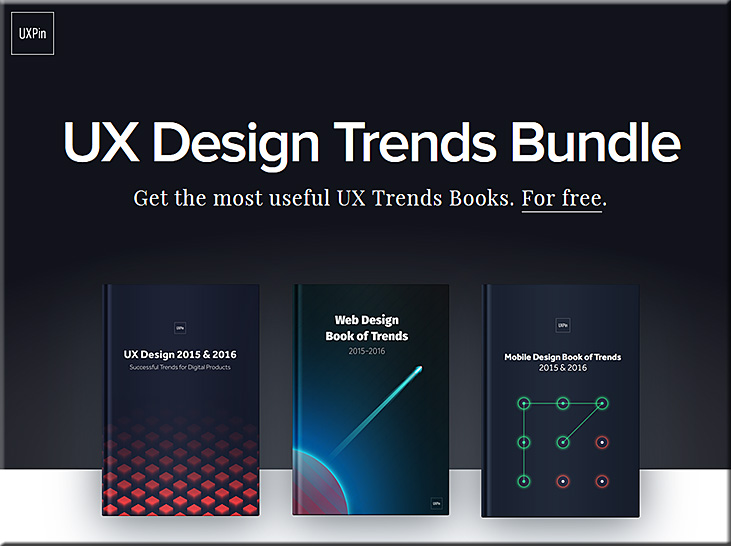
Web design trends of 2016: free ebook bundle — from creativebloq.com

Excerpt:

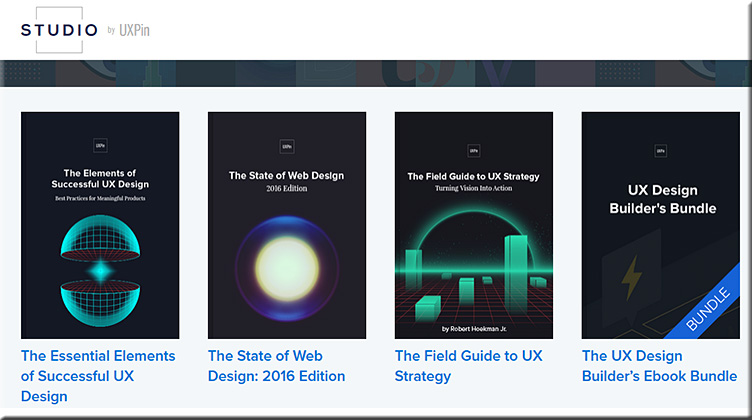
  • The first book, UX Design 2015 & 2016, explains the six most useful UX design trends of the past year, like advanced personalization, device-agnosticism, microinteractions, and the rebirth of gamification.
  • The second book, Web Design Book of Trends 2015 & 2016, explores the ten UI trends that gained traction this year including the cards layout, fluid animations, minimalism, and the new possibilities of typography.
  • Last, Mobile Design Book of Trends 2015 & 2016 gives the same treatment exclusively to mobile design, dissecting the best practices for gesture controls, layered interfaces, and how to apply the web trends for a smaller screen.


Also see:


USDesignTrendsBundle2015-2016


The multi-device world is evolving! — from upsidelearning.com by Amit Garg

Excerpt:

The multi-device world is certainly evolving. Existing devices are evolving in size while new devices are being added to the mix. All of this is resulting in evolving behavior patterns.

The smart thing to do is to get started with multi-device learning without waiting for the world to settle down. You might make a few mistakes, but will learn along the way and would still be better off as compared to those who never got started.


.

Smartphone Screen Size


“…the boundaries between tablets and smartphones are blurring…”


Translating physical spaces into digital experiences — from create-hub.com by Sorcha Daly
Cultural institutions have a big challenge on their hands in a digital age. How does the experience of a physical space, of visiting a building housing priceless objects, one-of-a-kind artefacts and engaging exhibitions, translate digitally?

Excerpts:

We’re seeing a huge increase in digital engagement with cultural institutions, with online visitor numbers far outweighing the number of people who make it through the doors. The British Museum, for example, received a whopping 35.3 million online visitors in 2014, compared with an in itself record-breaking 6.8 million physical visitors, the most of any UK museum or gallery. Add to this an impressive social media haul and that’s a lot of people who are engaging with the institution away from the building. This pattern is common to cultural institutions across the board.

So how exactly is digital changing the way people experience cultural institutions and how can they start using these changes as ways to better engage with audiences?

Several galleries have been using iPhone apps as enhanced alternatives to the audio tour guides, complete with additional interviews and comments from curators and personalities. Tate Modern’s London’s guide to last year’s Matisse Cut-Outs exhibition was particularly good, featuring additional images and an audio biography of the artist’s life. The Art Gallery of NSW also introduced a Chinese language guide app after noticing that there were many Chinese visitors to the gallery who would benefit from additional content.

These apps could be really powerful if extended across the entire visit to unlock stories throughout the building. Imagine walking past an unremarkable-seeming sculpture, for instance, and a tap notification appearing on your Apple Watch displaying a fascinating fact about the significance of the object. This could be powered with simple iBeacons technology.


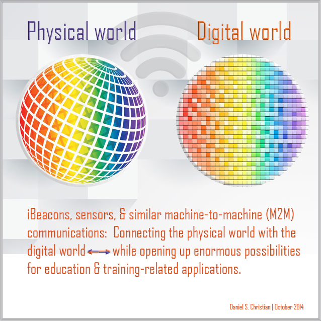
From DSC:
Might some of these same ideas and concepts be applied within our libraries? Our art galleries? Other locations?


DanielChristian-Combining-Digital-Physical-Worlds-Oct2014


The 3 instructional shifts that will redefine the college professor — from edsurge.com by Ryan Craig

Excerpts:

As faculty at colleges and universities are all too aware, it’s hard to do two jobs at the same time. Since the advent of the modern research university over a century ago, faculty have effectively held down two jobs: conducting (and publishing) research and teaching students.

Arguments for the dual-role professor seem logical. Knowledge production should make one a better instructor. Students should benefit from teachers producing the latest knowledge. But there’s precious little data to support that adding the research job to the instruction job improves student outcomes.

The downside is that both jobs require significant expertise and commitment to do well.

There is an emerging consensus as to what works best for onground instruction. It’s called the Dynamic Classroom, and it looks like this:

  • Flip classroom so “transfer of information” occurs ahead of class
  • Incorporate technology in the classroom (handheld clickers or smartphone apps) to quickly ascertain whether students have understood key concepts
  • Integrate active learning techniques to improve understanding of key concepts, including peer learning, group problem solving, project-based learning and experiential learning via studios and workshops
  • Include “perspective transformation” exercises wherein students change their frames of reference by critically reflecting on their assumptions


From DSC:
First of all, I second the idea of splitting up the responsibilities of researching and teaching. Both roles are full-time jobs and require different skillsets. With students paying ever higher tuition bills, students deserve to take their courses from professors who know how to teach (not an easy job by the way!). 

But the unbundling doesn’t — and shouldn’t — stop with the splitting up of the teaching and research roles.

Let’s look at another of the instructional shifts that Ryan considers — and that is the move towards the use of smartphones and apps:

In this environment, we can imagine one app for Economics 101 and another for Psychology 110. They are also the ideal platform for simulations and gamified learning and can tailor the user experience further by incorporating real-world inputs (e.g., location of the student) into the material. But, like the dynamic classroom, apps require an unparalleled level of development and instructional expertise—a full-time job for faculty who will be teaching online.

I think there’s some serious potential with this approach, especially given the trend towards more mobile computing and the affordances that come with using mobile technologies.

However, when we start delivering teaching and learning experiences that involve the digital/virtual realm like this, we’re instantly catapulted into a world that requires additional skills. As such, I highly doubt that the majority of faculty members have the time, interests, passions, or the abilities/gifts to code such apps.  They would have to simultaneously be (or become) a programmer/developer, an instructional designer, a graphic designer, a copyright expert, an expert in accessibility, instantly knowledgeable in user interface and user experience design, as well as continue to serve as the Subject Matter Expert (SME) — and I could list other roles as well. That is why we need TEAMS of specialists. If the trends towards moving more of our teaching and learning experiences online and/or into such digital realms continue, then our current models simply won’t cut it anymore, at least in the majority of cases.

I appreciate Ryan’s article and second the main idea of splitting up the teaching and researching responsibilities. But again, when we’re talking developing apps, we had better be talking employing the use of teams — or the students will likely not be better off.

—–

A related quote from “In Sign of the Times for Teaching, More Colleges Set Up Video-Recording Studios” — from The Chronicle

At some colleges, media teams sit down with professors ahead of time and lay out long-term strategies to determine how video may enhance the learning experience of students in their courses.

The media team offers instructors a number of planning worksheets to encourage them to think more about the purpose of videos in their courses.


 —–


From DSC:
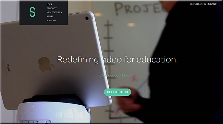
Swivl allows faculty members, teachers, trainers, and other Subject Matter Experts (SMEs) to make recordings where the recording device swivels to follow the SME (who is holding/wearing a remote). Recordings can be automatically sent to the cloud for further processing/distribution.

My request to you is:
Can you extend the Swivl app to not only provide recordings, but to provide rough draft transcripts of those recordings as well?

This could be very helpful for accessibility reasons, but also to provide students/learners with a type of media that they prefer (video, audio, and/or text).


Swivl-2015


From DSC:
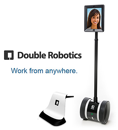
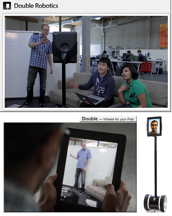
A note to Double Robotics — can you work towards implementing M2M communications?

That is, when our Telepresence Robot from Double Robotics approaches a door, we need for sensors on the door and on the robot to initiate communications with each other in order for the door to open (and to close after __ seconds). If a security clearance code is necessary, the remote student or the robot needs to be able to transmit the code.

When the robot approaches an elevator, we need for sensors near the elevator and on the robot to initiate communications with each other in order for the elevator to be summoned and then for the elevator’s doors to open. We then need for the remote student/robot to be able to tell the elevator which floor it wants to go to and to close the elevator door (if if hasn’t already done so).

Such scenarios imply that we need:

  1. Industry standards for such communications
  2. Standards that include security clearances (i.e., “OK, I’ll let you into this floor of this public building.” or “No, I can’t open up this door without you sending me a security clearance code.”)
  3. Secure means of communications


DoubleRobotics-Feb2014


doublerobotics.com -- wheels for your iPad


A major request/upgrade might also include:

  • The ability for the Double App on the iPad to make recordings, have an auto send option to send those recordings to the cloud, and then provide transcripts for those recordings. This could be very helpful for accessibility reasons, but also to provide students/learners with a type of media that they prefer (video, audio, and/or text).


From DSC:
We continue to see more articles and innovations that involve the Internet of Things (IoT) or the Internet of Everything (IoE). This trend has made me reflect upon what I think will be a future, required subset of needed expertise within the fields of Instructional Design, User Experience Design, User Interface Design, Product Development, Programming, Human Computer Interaction (HCI), and likely other fields such as Artificial Intelligence (AI), Augmented Reality (AR), and Virtual Reality(VR) as well.

And that is, we will need people who can craft learning experiences from the presence of beacons/sensors and that integrate such concepts as found in “If This Then That” (ifttt.com) whereby one is putting the Internet and cloud/mobile-based applications to work for you. Certainly, those involved in retail are already busy working on these types of projects. But those of us involved with learning, human computer interaction (HCI), and interface design need to get involved as well.


IfThisThenThat-Combined-With-iBeacons


For example, this potential scenario of a K-12 field trip might be fodder for such a learning experience.

So for those individuals who are involved with the aforementioned disciplines…we need to pulse check what new affordances are coming from the rollout and further development of the IoT/IoE.


How do we create an advanced experience ecosystem? — from uxmag.com by Dallas Sargent

Excerpt:

“The Internet of Things is interesting because it forces us to rethink the interaction paradigms we have with objects—that is, something is different about our engagement with a smart object versus a ‘dumb’ one,” writes Thomas Wendt in his recent UX Magazine article, “Internet of Things and the Work of the Hands.”

Whatever you choose to call the grayish area sitting at the intersection of wearable technology, customizable sensors, and enhanced connectivity, it seems likely that this is where the next major breakthroughs in experience design will take place. Cisco estimates that by 2020, there will be 50 billion things connected to the Internet, so whether we settle on the “Internet of Things,” “The Internet of Everything,” or an “Experience Ecosystem,” the space is primed for explosive growth.

As Wendt notes, there is something different about interacting with smart objects and, “It’s our job to understand what that something is.” That something has been illusive in recent years, with users adopting to wearable tech slowly and a noticeable lack of sophisticated communication between objects. After all, an object sharing information with your smartphone or tablet only constitutes a relationship, it takes many more overlapping relationships to create an ecosystem.


Also see:

Apple pioneer Bill Fernandez on Google Glass, Oculus Rift and the look of the future — from cnet.com by Jason Hiner
In his time at Apple, Bill Fernandez helped develop technologies that have shaped modern computing. He also has a keen perspective on what’s next.

Excerpt:

“The true user interface is the gestalt of many things: industrial design, ergonomics, internal hardware, performance, error handling, visual design, interaction, latency, reliability, predictability, and more. For this reason I’m glad to see my profession moving from the concept of user “interface” (where the user interacts with the screen) to user ‘experience’ (where more the above factors are considered),” said Fernandez.

“I can design the best user interface in the world on paper, but if it’s not implemented well by the hardware and software engineers (e.g. the product is slow or buggy) then the product will fail. If you do a really good job of designing a product then everyone who sees it thinks it’s so obvious that they could have done it themselves.”

“So there will be a seamless, multimodal UI experience using sight, sound, voice, head motion, arm movement, gestures, typing on virtual keyboards, etc. There have been pieces of this in research for decades. Only now are we beginning to see some of these things emerge into the consumer market: with Google Glass, Siri, etc. We have further to go, but we’re on the road.”


From DSC:
I’m intrigued with the overlay (or should I say integration?) of services/concepts similar to IFTTT over the infrastructure of machine-to-machine communications and sensors such as iBeacons. I think we’re moving into entirely new end user experiences and affordances enabled by these technologies. I’m looking for opportunities that might benefit students, teachers, faculty members, and trainers.


Last week I attended the 20th Annual Online Learning Consortium International Conference.  While there, I was inspired by an excellent presentation entitled, A Disruptive Innovation: MSU’s Surviving the Coming Zombie Apocalypse – Are You Ready to Survive a New Way of Learning?   The four team members from Michigan State University included:

  • Glenn R. Stutzky | Course Instructor
  • Keesa V. Muhammad | Instructional Designer
  • Christopher Irvin | Instructional Designer
  • Hailey Mooney | Course Librarian

Check out the intro clip on the website about the course:
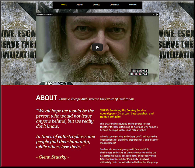
 

MSUZombie-Oct2014


From the description for the presentation:

This session highlights MSU’s award winning, groundbreaking online course that fuses social theory, filmmaking, social media, and viral marketing while students survive an apocalyptic event. http://zombie.msu.edu/

MSU created and used powerful digital storytelling and multimedia to overlay real, experiential, immersive learning. Important content was relayed, but in a way that drew upon your emotions, your ability to solve problems and navigate in a world where you didn’t have all of the information, your ability to work with others, and more.

“This innovative course integrates current research and science on catastrophes and human behavior together with the idea of a zombie apocalypse. In doing so, we actively engage with students as they think about the nature, scope, and impact of catastrophic events on individuals, families, societies, civilizations, and the Earth itself.”

“Our innovative approach to teaching and learning features: students as active participants, the instructor becomes the facilitator, storytelling replaces lectures, zombies become the catalyst of teaching, a “zombrarian” (librarian) drives research, and the students emerge as digital storytellers as a way of assessing their own learning.”

Others outside MUS have found out about the course and have requested access to it. As a result of this, they’ve opened it up to non-credit seeking participants and now various people from police forces, Centers for Disease Control, and others are able to take the course. To make this learning experience even more accessible, the cost has been greatly reduced: from $1600+ to just $500. (So this talented team is not only offering powerful pedagogies, but also significant monetary contributions to the university as well.)

For me, the key thing here is that this course represents what I believe is the direction that’s starting to really pull ahead of the pack and, if done well, will likely crush most of the other directions/approaches.  And that is the use of teams to create, deliver, teach, and assess content – i.e., team-based learning approaches.

So many of the sessions involved professional development for professors and teachers – and much of this is appropriate. However, in the majority of cases, individual efforts aren’t enough anymore.  Few people can bring to the table what a talented, experienced group of specialists are able to bring.  Individual efforts aren’t able to compete with team-based content creation and delivery anymore — and this is especially true online, whereby multiple disciplines are immediately invoked once content hits the digital realm.

In this case, the team was composed of:

  • The professor
  • Two Instructional Designers
  • and a librarian

The team:

  • Developed websites
  • Designed their own logo
  • Marketed the course w/ a zombie walking around campus w/ brochures and a walking billboard
  • Used a Twitter stream
  • Used a tool called Pensu for their students’ individual journals
  • Made extensive use of YouTube and digital storytelling
  • Coined a new acronym called MOLIE – multimedia online learning immersive experience
  • Used game-like features, such as the development of a code that was found which revealed key information (which was optional, but was very helpful to those who figured it out).  The team made it so that the course ended differently for each group, depending upon what the teams’ decisions were through the weeks
  • Used some 3D apps to make movies more realistic and to create new environments
  • Continually presented new clues for students to investigate.  Each team had a Team Leader that posted their team’s decisions on YouTube.

They encouraged us to:
THINK BIG!  Get as creative as you can, and only pull back if the “suits” make you!  Step outside the box!  Take risks!  “If an idea has life, water it. Others will check it out and get involved.”

In their case, the idea originated with an innovative, risk-taking professor willing to experiment – and who started the presentation with the following soliloquy:

Syllabi are EVIL

Syllabi are EVIL and they must die!
Listen to me closely and I’ll tell you why.
Just want students to know what is known?
See what’s been seen?
Go – where we’ve been going?
Then the Syllabus is your friend,
cuz you know exactly where you’ll end.
But if you want to go somewhere new,
see colors beyond Red, Green, and Blue.
Then take out your Syllabus and tear-it-in-half,
now uncertainty has become your path.
Be not afraid because you’ll find,
the most amazing things from Creative Minds,
who have been set free to FLY,
once untethered from the Syllabi.

Glenn Stutzky
Premiered at the 2014
Online Learning Consortium International Conference
October 29, 2014


They started with something that wasn’t polished, but it’s been an iterative approach over the semesters…and they continue to build on it.

I congratulated the team there — and do so again here. Excellent, wonderful work!


By the way, what would a creative movie-like trailer look like for your course?


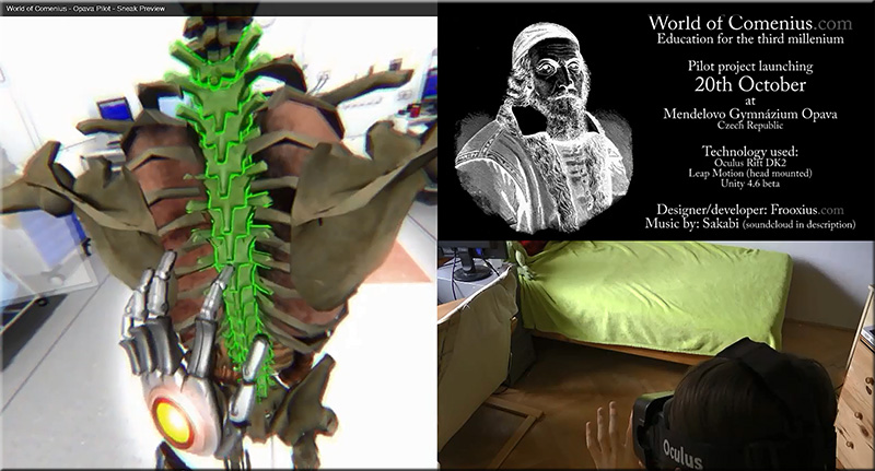
World-of-Comenius-Oct2014


‘World of Comenius’ demonstrates powerful educational interaction w/ Leap Motion & Oculus Rift and Tomas “Frooxius” Mariancik

Excerpt:

We recently covered a (at that point unnamed) VR project by developer Tomáš “Frooxius” Marian?ík, the mind behind the stunning ‘Sightline’ VR series of demos. The project fused Leap Motion skeletal hand tracking with Oculus Rift DK2 positional tracking to produce an impressively intuitive VR interface. Now, a new video of the interface  shows impressive progress. We catch up with Tomáš to find out some more about this mysterious VR project.

Enter the ‘World of Comenius’
The virtual reality resurgence that is currently underway, necessarily and predictably concentrates on bringing people new ways to consume and experience media and games. This is where virtual reality has the best chance of breaking through as a viable technology, one that will appeal to consumers worldwide. But virtual reality’s greatest impact, at least in terms of historical worth to society, could and probably will come in the form of non-entertainment based fields.


Also see:


From DSC:
I’m thinking out loud again…

What if were were to be able to take the “If This Then That (IFTTT)” concept/capabilities and combine it with sensor-based technologies?  It seems to me that we’re at the very embryonic stages of some very powerful learning scenarios, scenarios that are packed with learning potential, engagement, intrigue, interactivity, and opportunities for participation.

For example, what would happen if you went to one corner of the room, causing an app on your mobile device to launch and bring up a particular video to review?  Then, after the viewing of the video, a brief quiz appears after that to check your understanding of the video’s main points. Then, once you’ve submitted the quiz — and it’s been received by system ABC — this triggers an unexpected learning event for you.

Combining the physical with the digital…

Establishing IFTTT-based learning playlists…

Building learning channels…learning triggers…learning actions…

Setting a schedule of things to do for a set of iBeacons over a period of time (and being able to save that schedule of events for “next time”).

Hmmm…there’s a lot of potential here!


IfThisThenThat-Combined-With-iBeacons


IfThisThenThat


iBeaconsAndEducation-8-10-14


Now throw augmented reality, wearables, and intelligent tutoring into the equation! Whew!

We need to be watching out for how machine-to-machine (M2M) communications can be leveraged in the classrooms and training programs across the globe.

One last thought here…
How are we changing our curricula to prepare students to leverage the power of the Internet of Things (IoT)?


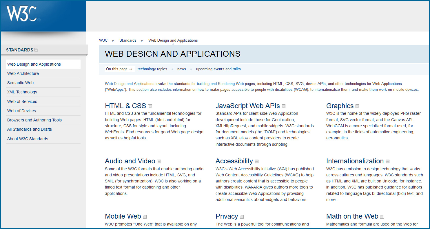
W3C: Web Design & Applications

W3C-WebDesignMarch2014


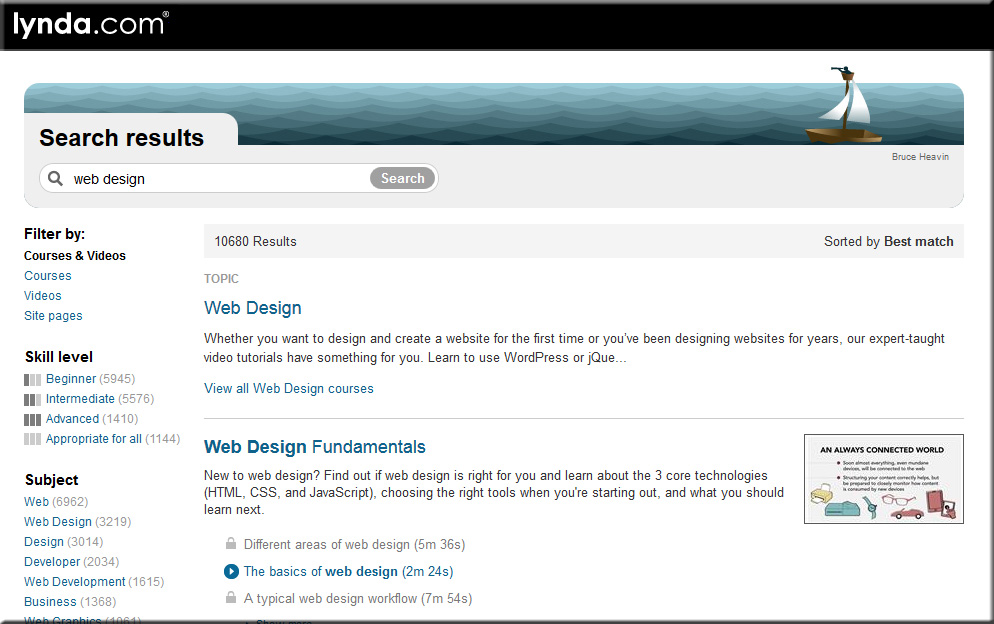
Lynda.com

LyndaDotComWebDesign-March2014


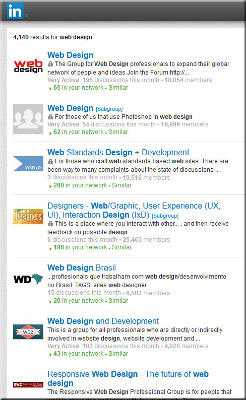
Web Design Groups on LinkedIn.com

LinkedInWebDesignGroups-March2014


Relevant hashtags on Twitter:


Top Designer Google+ Communities You Should Follow — from hongkiat.com by Charnita Fance. Filed in Web Design.

Excerpt:

If you are active on Google+ there are a lot of communities for web designers or UI designers to join. Google+ Communities are like online groups or forums where people can come together to talk about a common hobby, interest or career (such as Design). Only members of a given community can see your posts in their stream. As a designer, this is great because you can share your work and get feedback from thousands of other designers, for free.

In the design communities below, you’ll find lots of great information, freebies, tips and tricks, and personal design work from members. Plus, you can ask for help or offer help to others. Let’s find the perfect Google+ design community for you.


Fresh Resources for Designers and Developers — March 2014 — from hongkiat.com


Infographic: HTML5 vs. native mobile app development [updated] — from kony.com by Dipesh Mukerji — also see his posting: Developing apps with HTML5: benefits and challenges


Responsive e-learning in a Multi-Device World — from elearning-reviews.traineasy.com

Excerpt:

“Day by day, the number of devices, platforms, and browsers that need to work with your site grows. Responsive web design represents a fundamental shift in how we’ll build websites for the decade to come,” says Jeffrey Veen, CEO & Cofounder of Typekit.


New ebook all about web design for Google Glass — from glassalmanac.com by Christian Bullock

Excerpt:

Well that was fast.

As someone who didn’t really know too many people were currently all about ensuring a site’s web design was fit for Google Glass browsing, there’s now an eBook by author Joe Casabona (known for his blog People Reacting to Glass) that’s a guide to web design for Glass.

Pretty cool idea and something I could see as being crucial when Glass launches publicly. I’m sure Glass adoption won’t be as high as tablet or smartphone adoption rates, but as we’re seeing now, it’s necessary for web designers to think of other ways people are interacting with websites aside from normal desktop or laptop computers.


Webmonkey.com


WebDesignerDepot.com


WebDesign.Tutsplus.com


 Addendums on 4/1/14:

 
© 2024 | Daniel Christian