Amazon now lets you test drive Echo’s Alexa in your browser — from by Dan Thorp-Lancaster

Excerpt:

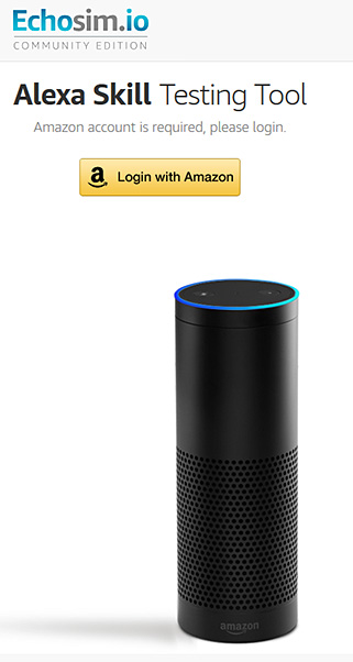
If you’ve ever wanted to try out the Amazon Echo before shelling out for one, you can now do just that right from your browser. Amazon has launched a dedicated website where you can try out an Echo simulation and put Alexa’s myriad of skills to the test.


Echosimio-Amazon-EchoMay2016


From DSC:
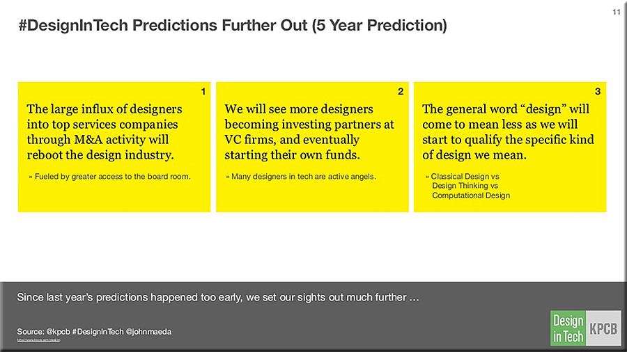
The use of the voice and gesture to communicate to some type of computing device or software program represent growing types of Human Computer Interaction (HCI).  With the growth of artificial intelligence (AI), personal assistants, and bots, we should expect to see more voice recognition services/capabilities baked into an increasing amount of products and solutions in the future.

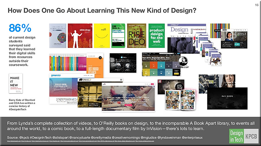
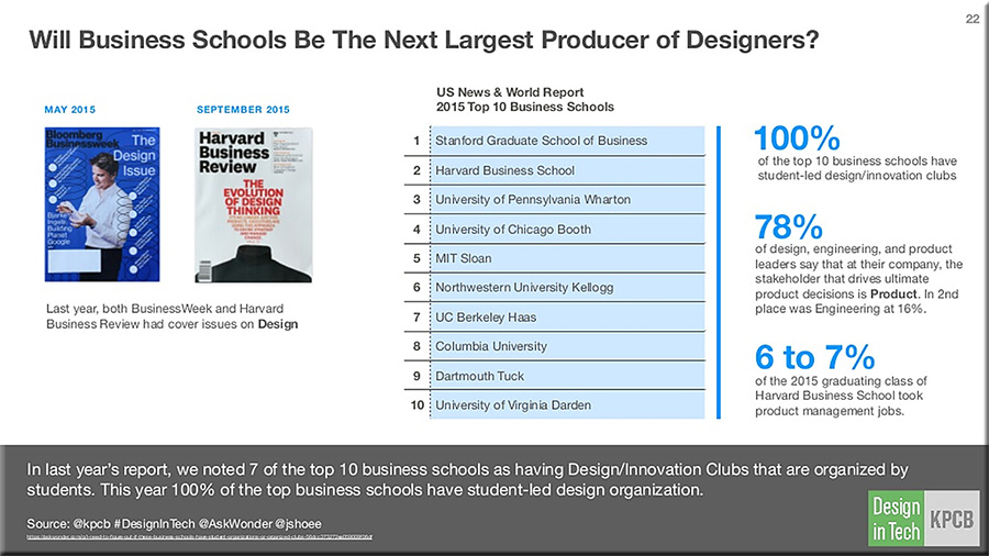
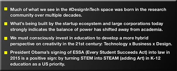
Given these trends, personnel working within K-12 and higher ed need to start building their knowledgebases now so that we can begin offering more courses in the near future to help students build their skillsets.  Current user experience designers, interface designers, programmers, graphic designers, and others will also need to augment their skillsets.


Beyond touch: designing effective gestural interactions — from blog.invisionapp.com by by Yanna Vogiazou; with thanks to Mark Pomeroy for the resource


The future of interaction is multimodal.


Excerpts:

The future of interaction is multimodal. But combining touch with air gestures (and potentially voice input) isn’t a typical UI design task.

Gestures are often perceived as a natural way of interacting with screens and objects, whether we’re talking about pinching a mobile screen to zoom in on a map, or waving your hand in front of your TV to switch to the next movie. But how natural are those gestures, really?

Try not to translate touch gestures directly to air gestures even though they might feel familiar and easy. Gestural interaction requires a fresh approach—one that might start as unfamiliar, but in the long run will enable users to feel more in control and will take UX design further.


Forget about buttons — think actions.


Eliminate the need for a cursor as feedback, but provide an alternative.


Adobe Photoshop unveils artificial intelligence tool to identify fonts from 20,000 typefaces — from ibtimes.co.uk by Mary-Ann Russon

Excerpt:

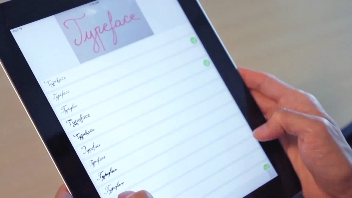
Graphic designers, rejoice – the hours upon hours of struggling to figure out what a type face is will finally be over as Adobe is adding an artificial intelligence tool to help detect and identify fonts from any type of picture, sketch or screenshot.

The DeepFont system features advanced machine-learning algorithms that send pictures of typefaces from Photoshop software on a user’s computer to be compared to a huge database of over 20,000 fonts in the cloud, and within seconds, results are sent back to the user, akin to the way the music discovery app Shazam works.


Virtual reality: The Next Big Thing for college creatives — from college.usatoday.com by Morgan Buckley, University of Southern California

Excerpt:

College students across the country — from the University of Southern California to the University of Minnesota to Southern Methodist University — are also experimenting with virtual reality applications via clubs, design labs and hackathons.

The tech industry is taking note.

Among the bigger showcases for the technology took place last month, when the University of Southern California’s Virtual Reality Club (VRSC) hosted its first annual Virtual Reality Festival and Demo Day, a showcase of projects and panels with The Walt Disney Company as its title sponsor.

Students traveled from the University of California-San Diego, UCLA, Chapman University, Loyola Marymount University and the University of Colorado-Boulder to attend the fest. The judges were industry professionals from companies including NVIDIA, Google, Maker Studios and Industrial Light and Magic’s X Lab.

Some $25,000 in prizes were split among winners in four categories: 360 Live-Action Videos, 360 Animation, Interactive VR Games and Immersive Technology/Augmented Reality (AR). VR/AR categories ranged from health care to games, journalism, interactive design and interpretive dance.


The differing roles of the UX Designer — from uxmag.com by Rosie Allabarton
…different companies expect vastly different things from the same job.

Excerpt:

What does it mean to be a UX designer?
Whether you land a job at a startup or a larger corporation, your role as UX designer will be directly involved in the process to make a product useful, usable and delightful for that company’s intended target user group. Whether you are managing a large team of UXers or flying solo, the UX process itself remains the same and in general works in this order:

User Research
User research involves speaking to real users in your target audience about your product. If the product doesn’t exist yet, it’s about speaking to users of similar products and finding out what they want from this kind of platform. If it’s a pre-existing product, you’ll be asking questions about how they feel navigating your current design, their success in reaching their goals, and if they find the information they’re looking for easily and intuitively. A number of methods are usually adopted for this part of the process, including: questionnaires, focus group discussion, task analysis, online surveys, persona creation and user journey map.

Design
During the design phase you’ll be primarily thinking about how your product/service can accommodate how the customer already behaves (as seen during User Research). The design of your product revolves around functionality and usability, rather than colors or pictures (these are established later by a visual designer). Having established during your user research what your users expect from your product or site, what their goals are and how they like to operate a system, it is functionality and usability that will be your focus now. During this phase you will be using the following techniques to design your user’s journey through the site: information architecture, wireframing, prototyping.

Testing
Testing allows you to check that the changes you made during the design phase (if redesigning an existing product) stand up to scrutiny. It’s a great way to eliminate problems or user difficulties that were unforeseen in the design phase before getting started on the implementation phase. Testing methods include: usability testing, remote user testing, a/b testing. (Bear in mind that testing can be repeated at any stage in the process, and often is to increase the quality of the design and fix any errors.)

Implementation
If you’ve not had much experience working with web developers, then it’s important to consider this crucial aspect of the role. During implementation you will be working intimately with developers to reach your end goal for a project. The developers will be working to transform your design ideas into a real, working website; how you approach this relationship will determine the success or failure of your project. Keeping your developers in the loop throughout the process will make this final phase easier for everyone involved; you as the UX designer will have realistic expectations of what the developers can produce (and in what time-frame) and the developers won’t get any nasty shocks at the last minute.

Officially, a UX designer is responsible for this entire process, and its execution. However, larger companies tend to break this role down into a few, smaller roles that focus entirely on one section. We will look at what these roles are in the next section.

What other roles fall under the ‘UX Design’ umbrella?…<read more here>


From DSC:
A UX Designer, ideally, would be one of the people around the table in higher education that’s helping to create excellent learning experiences. How many organizations are using one? Probably not many.  Instead, such duties are most likely being lumped into the role of the Instructional Designer or the Instructional Technologist — or is yet another hat that the faculty member is supposed to be wearing.


From Relentless Designs LLC


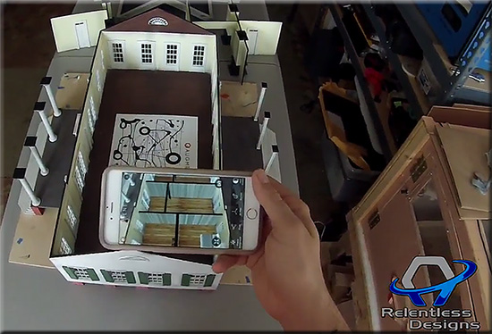
RelentlessDesignsApril2016-3DAR


Description:

Combining Augmented Reality into 3D Printing makes it “Animated Physical Models.” Combining new technology to grab the attention people will change the whole business meeting world.

Highlights:

  • Use of 3D models vs. static drawings on paper
  • Use of augmented reality to show things that aren’t really there…yet

Also see:


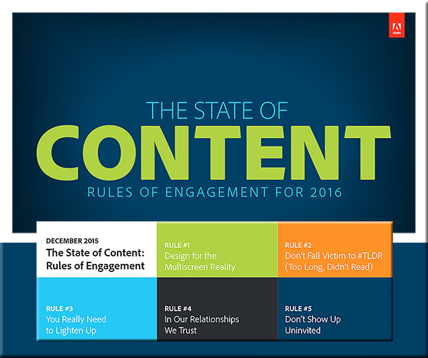
State-of-Content-Adobe-2016


Excerpt:

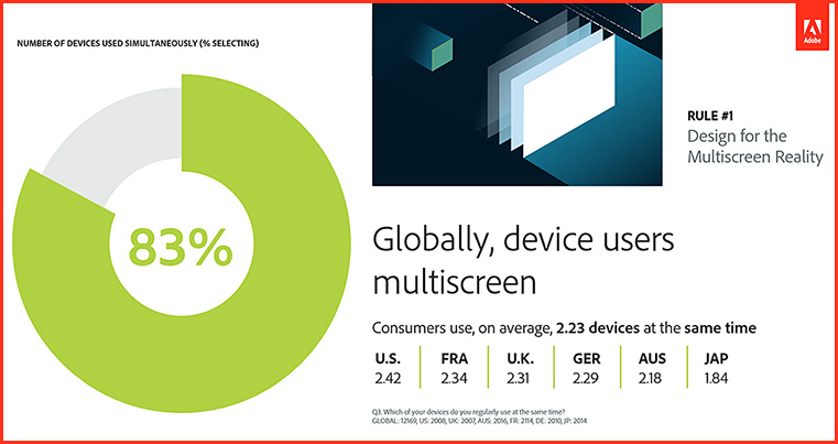
RULE #1: DESIGN FOR THE MULTISCREEN REALITY
Consumers are multiscreening more than ever before — optimize your content for it

  • On average, 83 percent of global consumers report they multiscreen, using 2.23 devices at the same time.


Design-Multiscreenreality-March2016


As attention spans shrink, 59 percent of consumers globally would rather engage with content that’s beautifully designed than simple — even when short on time.


More than half of consumers (57%) would prefer to watch videos on breaking news vs. read an article and 63 percent would rather skim several short stories than read deeper articles.


Globally, consumers use an average of 5 devices and 10 services


Adobe’s Project Comet has been renamed ‘Experience Design’ — and it [launched on 3/14/16] — from thenextweb.com by Nate Swanner

Excerpt:

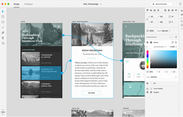
Adobe’s Project Comet is now Experience Design (XD), and is available in preview for anyone with an existing Adobe account.

Noting there are currently “lots of tools tackling many parts of the problem” of designing apps, Adobe is positioning XD to compete more directly with Sketch, and it does a fantastic job. Not only will you be able to design artboards, but XD lets you make macro changes and prototype as well.

It begins with the type of project you have (Web, iPhone, iPad or ‘custom size’ designs), but XD also has UI Kit packets preloaded. You can choose from iOS, Google’s Material Design or Windows. XD also shows you recent files so you can jump right back into prototyping.


Adobe-ExperienceDesign-3-14-16


FlexspaceDotOrg-March2016

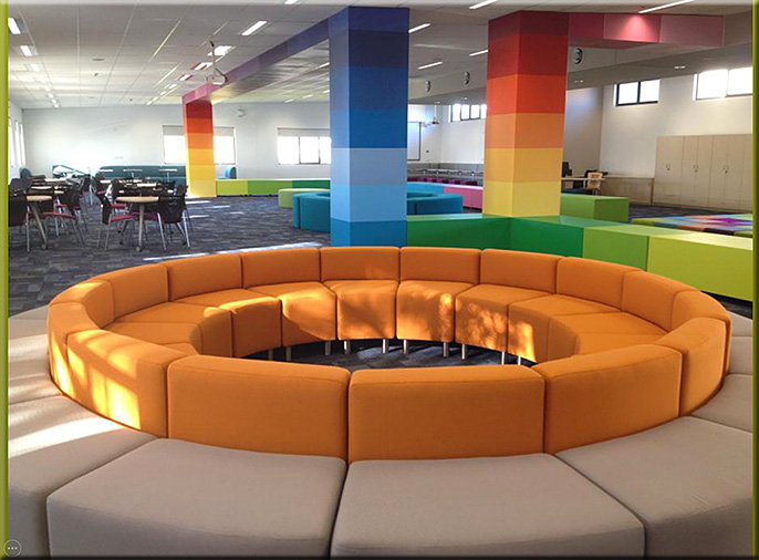
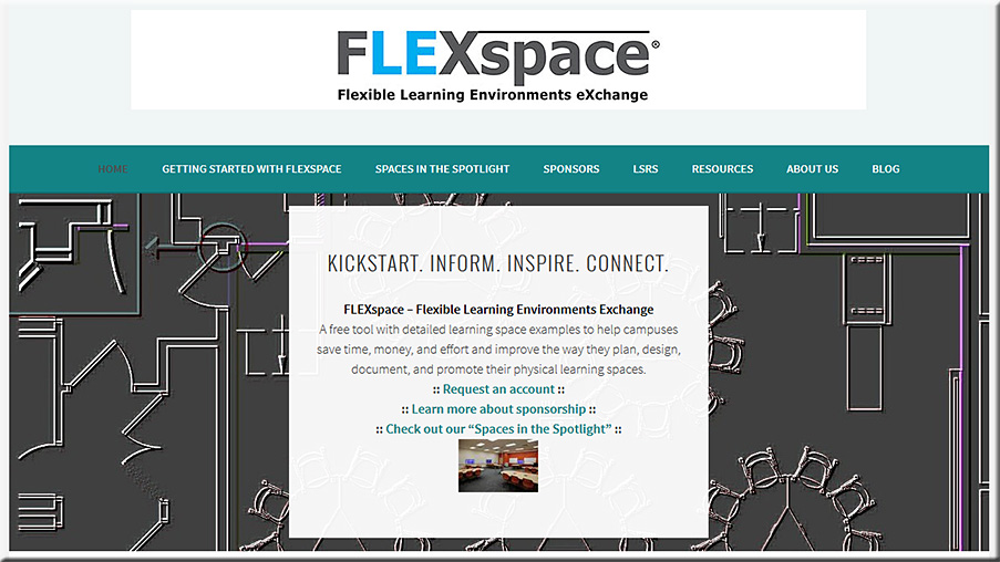
The Flexible Learning Environments eXchange – FLEXspace – is a robust, open access repository populated with examples of learning spaces. It contains high resolution images and related information that describes detailed attributes of these spaces from institutions across the globe. The incentive for participation is to showcase innovative design solutions open to peer review ranking and comments. As more contributions are received, the repository will emerge into a very useful planning resource for education and supporting entities at multiple levels.


From DSC:
You can browse images, video, and documents.

You can get some new ideas, sources of inspiration…and get the creative juices going. The site covers a variety of learning spaces — from large lecture halls to library lounges to active learning spaces.


5-minute film festival: Resources for filmmaking in the classroom — from edutopia.org by Amy Erin Borovoy

Excerpt:

I’ll admit I’m a bit biased here since I’m a filmmaker by trade, but I truly believe the process of planning and making videos can offer tremendous learning opportunities for students of almost any age. Not only is the idea of telling stories with video really engaging for many kids, filmmaking is ripe with opportunities to connect to almost every academic subject area. As the technology to shoot and edit films becomes more ubiquitous, where is a teacher with no experience in video production to begin? I’ve shared some resources below to help you and your students get started on making blockbusters of your own.


Top 20 User Experience Blogs and Resources of 2015 — from usabilitygeek.com by Matt Ellis

Example resources from that posting:


ux-design-feb2016


ux-design2-feb2016


ux-design3-feb2016

BONUS: 15 Honorable Mentions

The following is a list of other excellent user experience blogs that did not make it in this list but are so good that they are still worth a mention. So please be sure to check them out as well!


From DSC:
Though I’m sure this list is missing many talented folks and firms, it’s a great place to start learning about user experience design, interface design, interaction design, prototyping, and usability testing.


TopIllustrators2015


New York Public Library shares digital archive of 180,000 restriction-free images — from itsnicethat.com by Alexander Hawkins

Excerpt:

180,000 restriction-free images are now available in the New York Public Library digital collections. Including high res photographs, illustrations and maps, images can be downloaded easily and are free to share and use without permission. The collection can be viewed by genre or colour.


Hypnotic New Kinetic Sculptures by Anthony Howe — from thisiscolossal.com


Artists evolve: The dangers of creatively typecasting yourself — from 99u.com by Elizabeth Saunders

Excerpt:

It’s a deeply emotional struggle whenever we shift our fundamental “brand” or style of creative output. Picasso, Monet, and all creatives before and since have had to wrestle with the reality that to stay fresh, enthusiastic, and authentic, you have to disrupt yourself.

That takes courage.

In short: You are more than your “brand.” As a living, breathing, developing human being, you don’t need to be ashamed to change. It’s vulnerable to let go of some of the roles you’ve held for a very long time and the persona you’re known for. But it’s also incredibly freeing and an opportunity to truly come alive. Now is the time to be who you are now instead of carrying around the shell of who you once were.


Editorial Type


Illustrator Spotlight: Simón Prades


Illustrussia: January 15, 2016 — from designcollector.net


The next phase of UX: Designing chatbot personalities — from fastcodesign.com by
When the conversation is the interface, experience design is all about crafting the right words.

Excerpt:

You may have heard that “conversational interfaces” are the new hotness in digital product design. Why open and close a bunch of apps on your phone to get stuff done when you can invoke a text-message-like window and just say what you want done to a chatbot? Well, here’s one reason: what if the bot is annoying or tedious to talk to? In conversational UIs, personality is the new UX.


Five ways businesses need to rethink UX in 2016 — from information-age.com by Chloe Green
How can businesses keep pace with customer expectations of their online experiences? Digital technologies are evolving fast, and with them user experience expectations.

Excerpt:

In today’s technology-driven world, the task of keeping customers happy is a constantly moving target. Not least because customer expectations of their digital interactions with a business are continually evolving.
Therefore, keeping pace with the changing expectations that customers have of their online user experience (UX), has never been more important.
Yet even digitally savvy organisations may not yet be prepared to make the necessary UX improvements to ensure they are meeting changing customer expectations in 2016. So, what are the five considerations that must be made to enable businesses to keep pace with customer expectations of their online experiences?

“Once the things in the IoT are connected and given a voice, they become more than just ‘things.’ They become part of a living experience shaped by interactions among people, places, and objects, among product, nature, and life,” said Olivier Ribet, VP of High Tech for Dassault Systemes. “They become contributors to what beckons just beyond the IoT: the Internet of Experiences. Earning a piece of the Internet of Experiences requires a higher level of strategic thinking-or Experience Thinking-but the returns promise to be higher as well.”


How the Internet of Things changes traditional design and user experience — from huffingtonpost by Phil Simon

Excerpt:

Make no mistake: Design is no longer an afterthought at progressive organizations. Companies are hiring highly paid user-experience experts en masse–a trend that will only intensify as the Internet of Things (IoT) arrives.


Web design trends: 6 designs to end 2015 — from webimp.com.sg


6designstoend2015-web-imp


Be careful about these 6 web design trends in 2016 — from awwwards.com
Are Hamburger Menus, Parallax Scrolling and Complex Typography a help or a hindrance?

Excerpt:

Trends in web design, like fashion trends, come and go. Sometimes trends are dictated by necessity (like responsive design). Other trends are industry shifts, such as the change from skeuomorphism to flat design.

The decision to follow a trend must depend on the needs of your users and your business. The decision should never be based solely on “it’s what the cool sites are doing”. Fads fade. A site built only on trends quickly becomes out of date.

With that in mind, let’s look at the design trends that you might want to think twice about using.


Top web design trends for 2016 — from creativebloq.com
We round up the hottest web design trends set to dominate 2016.

Excerpt:

Just like any other field of design, web design trends come and go with the passing of time. Unlike many other fields, however, web design has a relentless driver to change: technology. Because the basis of the platform is ever changing, some of the trends in design for the web are as a result of improvements to what’s possible as much as a reflection on changing taste.

2015 has been an interesting year in terms of web design. The visual landscape for web designers has remained largely as it was in 2014, with only a refinement of the minimalist approach that has become popular over the past few years. Underneath the aesthetic treatment of pages, however, the web has been quietly progressing.


Addendums:

  • The Most Important Design Jobs Of The Future — from fastcodesign.com
    Designers at Google, Microsoft, Autodesk, Ideo, Artefact, Teague, Lunar, Huge, New Deal, and fuseproject predict 18 new design jobs.
    Excerpt:
    Here are 18 of the most important design jobs of the future, as identified by the men and women who will no doubt do much of the hiring. Most looked three to five years out, but some peered farther into the future (see: organ designer).
  • 10 reasons to get excited about design in 2016 — from thenextweb.com
    Excerpt:
    It’s become more and more apparent that the number of screens with which designs must interact as well as the number of users is only going to grow. What’s more, the growth seems to be exponential. Equally compelling is the number of intersecting technologies for which a designer must prepare.Simply put, the challenges have never been greater, nor the solutions more complex.With such adversity comes inevitable excitement. To further enumerate the trends and techniques that are just starting to inspire widespread awe, we present to you this decennial diatribe: the top 10 reasons it’s going to be exciting to be a designer in 2016.
 
© 2024 | Daniel Christian