.
From DSC:
I saw this at Mashable, and I wanted to post it here for a couple of reasons:
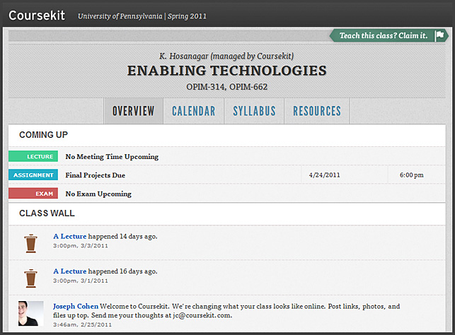
- Note the consistent interface between their courses — when putting a course online, we are entering into the world of interface design where consistency is very key, very helpful.
- Students at the University of Pennsylvania created this — so this provides a glimpse into what these students think a “course” should look like.


