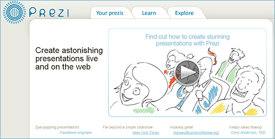
Prezi: A better way of doing presentations — from Faculty Focus by: John Orlando, PhD
Everyone seems to assume that a presentation must be accompanied by a PowerPoint. Conferences even require presenters to submit their PowerPoints as a condition of being accepted. But we’ve all seen terrible PowerPoints that detract from the presentation, and many people just don’t use PowerPoints well, hence the term “PowerPoint-induced sleep.”
But maybe it’s time to (gasp) question the use of PowerPoint itself (stick with me here)! Why do we assume that we must put up an outline of our points to help the audience understand them? The best presentations on TED are not accompanied by a PowerPoint of bulleted lists, but rather photos or other imagery that illustrate a point or make an effect. A speaker might flash the simple word “why” on the screen to prepare the audience for questioning a common belief. A single photo could be used to elicit a laugh or set the tone of the discussion.
One alternative to boring PowerPoint slides is to use Prezi. This web-based tool allows the user to create a single canvas of text, images, videos, etc. online. The presenter flies from location to location on the canvas, sometimes turning elements upside down, sometimes zooming in or out, to explore the relationship between ideas. Like a painter, the canvas draws the developer to choose visual imagery to create the presentation, in contrast to the text-heavy, outline-based methodology of PowerPoint.


